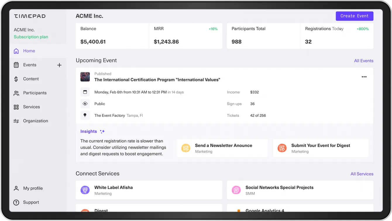
Timepad is an event platform where organizers create events, and participants buy tickets. I worked as a design director there and developed strategy for redesign which I led for two years. As well as built a team and implemented new hiring pipeline.
Reason for Redesign
The service was established in 2010 and became a leading platform for creating and attending events in its initial years. However, the design remained unchanged since then. In 2019, the service was acquired, and the new owner sought to refresh it and prepare for scaling in Eastern Europe. They assembled a new team of designers who initially focused on branding. I was brought in as a part-time contractor tasked with creating a design system and delivering daily design fixes.
While the design team proposed a complete overhaul of the service in one go, the business and development teams preferred a step-by-step approach to manage workload and analyze the impact of each step on product metrics. Understanding the desire to build cost-effective solutions, I proposed redesigning the service tab by tab, which was well-received by all stakeholders. Consequently, the previous design director left the company, and I assumed the role full-time.
Architecture
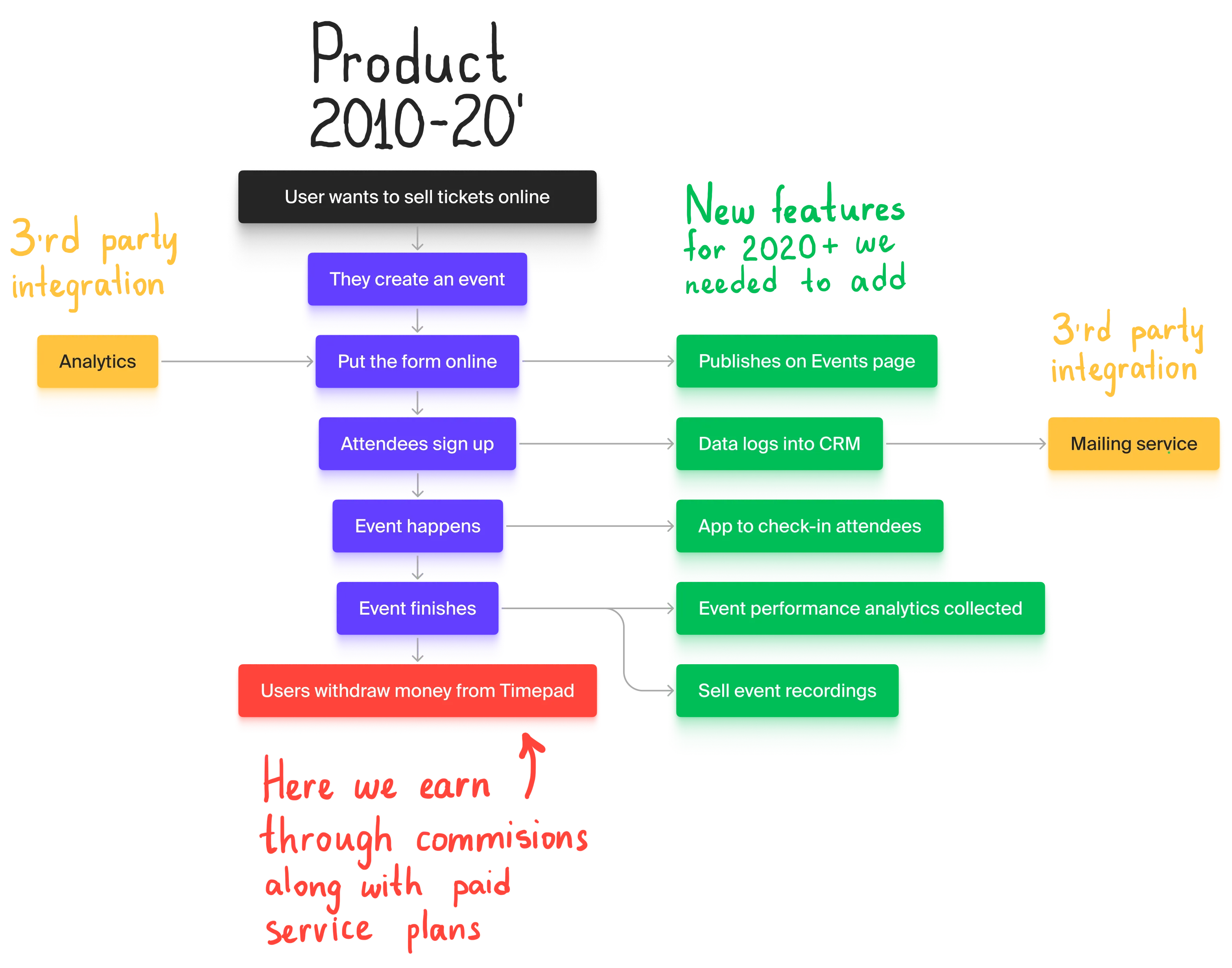
The service addressed the simple problem of selling tickets online but catered to diverse users, including those organizing multiple events weekly, annually, or even none at all. Their marketing expertise also varied, but it was evident that users engaged in constant marketing efforts generated more revenue.
To address these complexities, we decided to retain ticket sales as the core function while integrating CRM to streamline cohort management. We introduced ‘services’ as add-ons for power users to enhance event analytics or export participants to mailing services. Additionally, to boost event visibility, we aimed to create a website featuring all events on the platform.
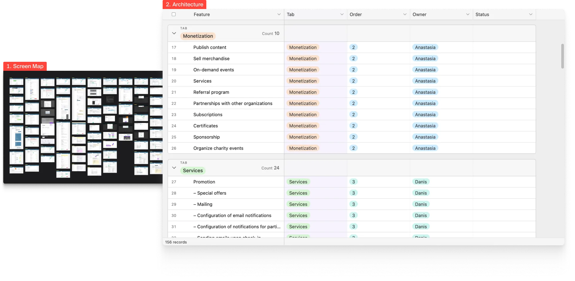
To gain a comprehensive understanding of the product, I created a screen map and mapped user stories onto it. This exercise revealed the need to reorganize features under relevant tabs based on their importance, which was determined through collaboration with support and product management teams.
New Layout
We initiated the redesign with a new React foundation to facilitate future changes, introducing a vertical navigation system to ensure accessibility on lengthy pages.
Design System Implementation
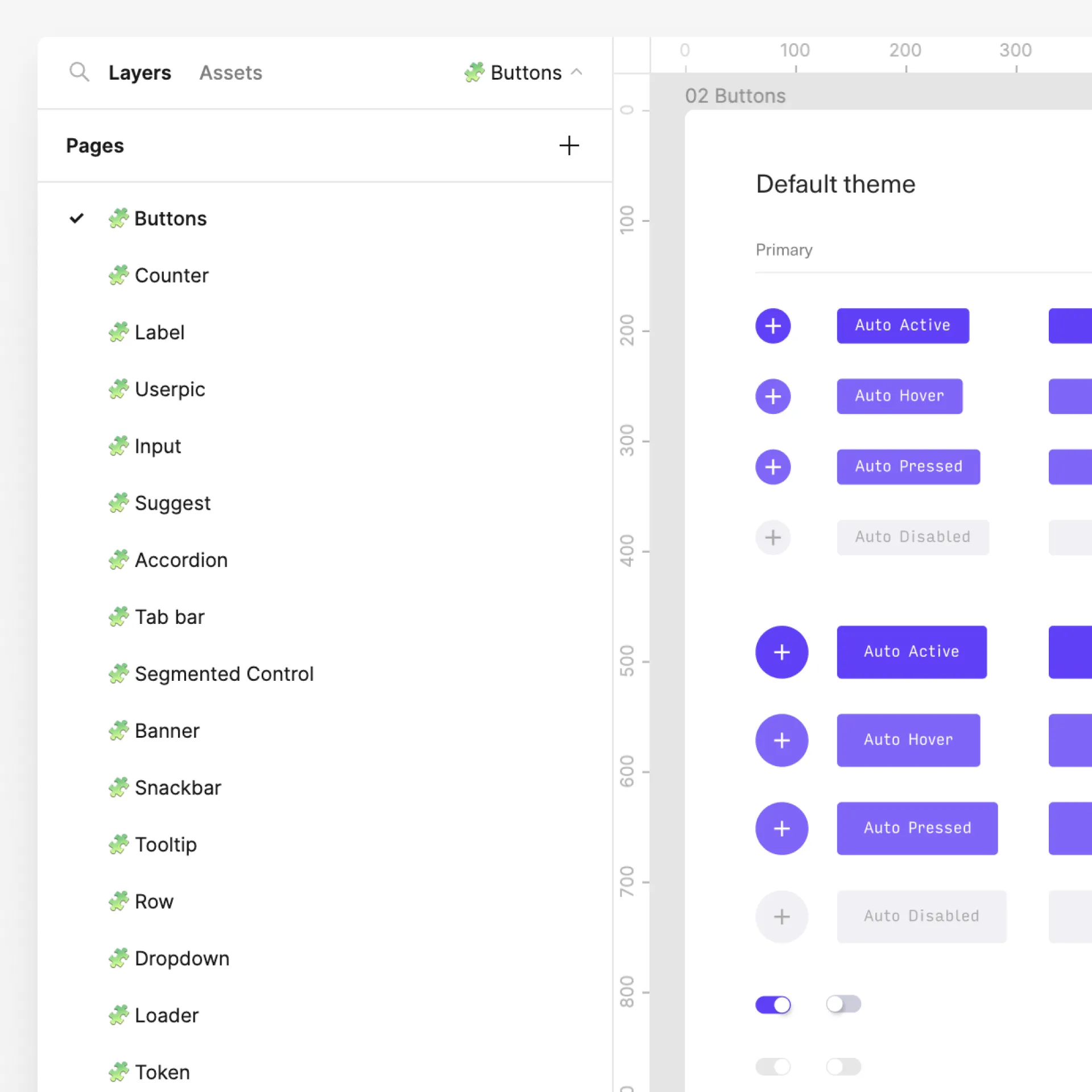
Our goal was to seamlessly integrate the design system into React development, with all developers contributing while working on product features. To achieve this, I collaborated with the head of frontend engineering to establish a streamlined process.
The process involved the product manager creating a task, followed by the design department delivering artboards, prototypes, and detailed component descriptions. Developers then implemented the feature and deployed it on a staging server alongside components in a Storybook. Subsequently, designers reviewed the work, provided feedback, and passed the task to QA before moving it to release.
Events
We updated the layout with a second-level navigation system to enhance event management.
Redesigned event creation to provide concise steps, progress feedback, and hints, reflecting a different mode of interaction. This mode was later adapted for content creation.
Content
Enabled users to sell content such as lectures and webinar recordings.
Services
Introduced a tab functioning as an AppStore for useful integrations.
Participants (CRM)
This feature, essentially a CRM, had been requested since 2010. User feedback during the design phase indicated strong enthusiasm for the concept from the outset.
Main Page
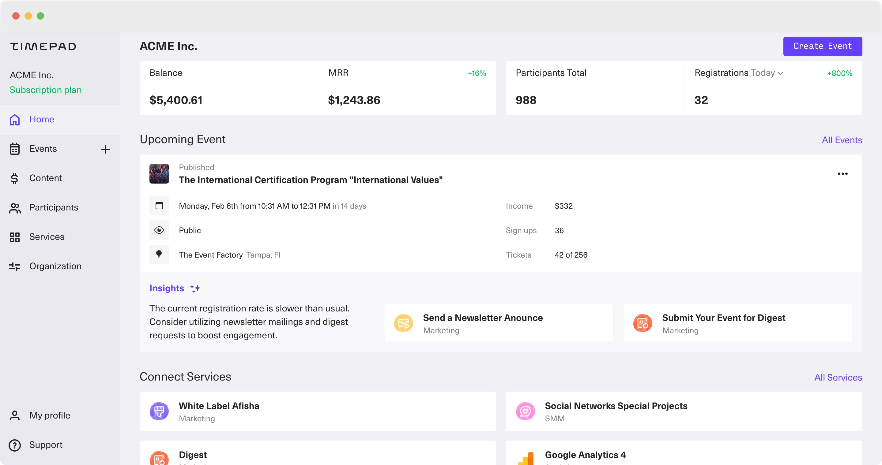
The main page served as a dashboard displaying upcoming events and signup progress.
Settings
A straightforward section dedicated to account settings.
Profile
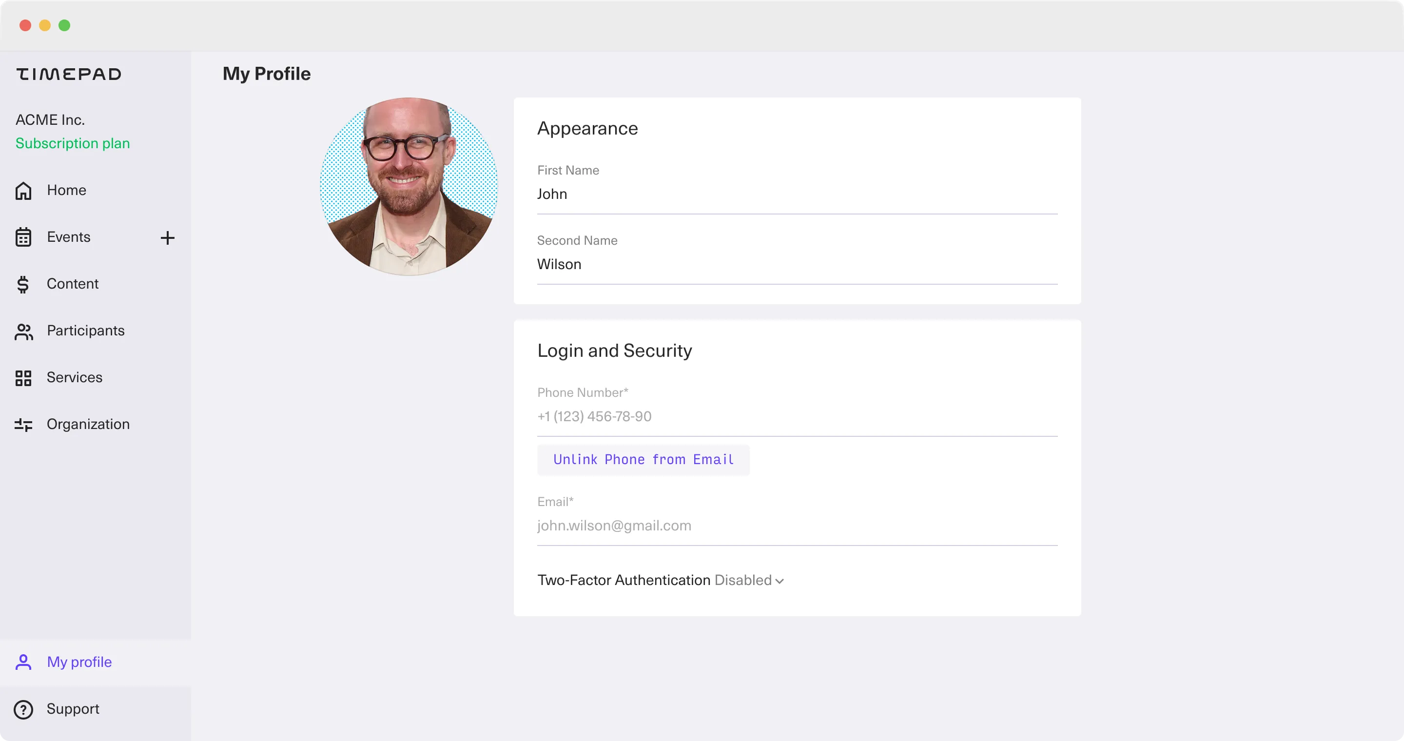
The profile page, while essential, was relatively straightforward in its functionality.
Afisha: Platform Events
Designed a main page, called Afisha, to showcase all platform events and ensure visibility for search engines. To make content easier to consume I provided this part of the product with more editorial than corporate design.
Mobile Version
We also focused on optimizing the user experience for mobile devices to ensure productivity on the go.
Main collaborators

Varvara Semenikhina
CEO

Dmitry Ukhanov
CTO

Dmitry Guzhov
Head of backend development

Eugene Petrichenko
Head of frontend development

Stasya Davydova
Core platform product manager

Artem Volchunovich
Frontend engineer

Ivan Gainulin
Lead product designer

Grigory Cheretov
Former design director & true legend
