The Beginning of my career was highlighted by my work at Eastern Europe’s most prominent companies.
Pandadoc
PandaDoc is an online platform that simplifies the process of creating, signing, and managing legal documents and contracts without the need for extensive legal expertise. I was a growth designer there.
Details
Onboarding
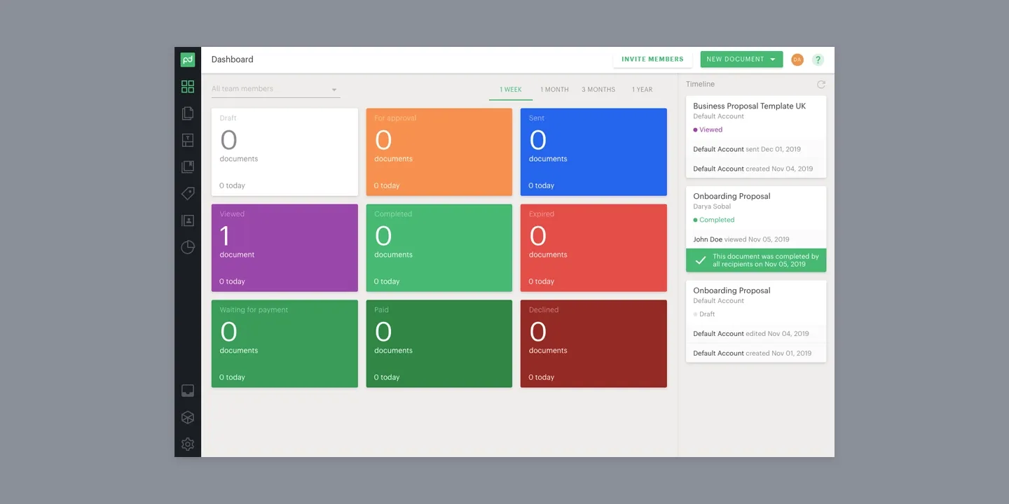
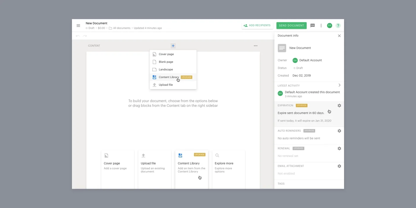
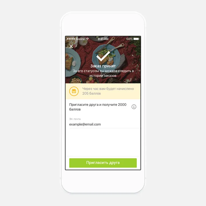
Customers have complex needs and the product must face it. It’s great when a single product can cover all the needs, but it also makes the product complicated to understand. This is what happened to PandaDoc, and the necessity for a broad onboarding was obvious.
We wanted to build an onboarding that would increase users’ activation continuously by serving them at different stages of their maturity within the product.
The business development team provided the data about user groups to me. My job was to figure out how to tell them “stories” about the product and the features in an appropriate way, as well as how to integrate this “learning center” into the product as a component gracefully.
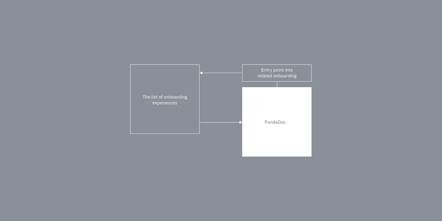
I came into a concept where we have separated tours with several specific learning guides, and the entry point which can be shown depending on the situation. For example, if a user duplicates a document and sends it several times, we can introduce templates to her. thus providing non-aggressive and task-related support. In other situations, onboarding can be reached from the navigation menu.
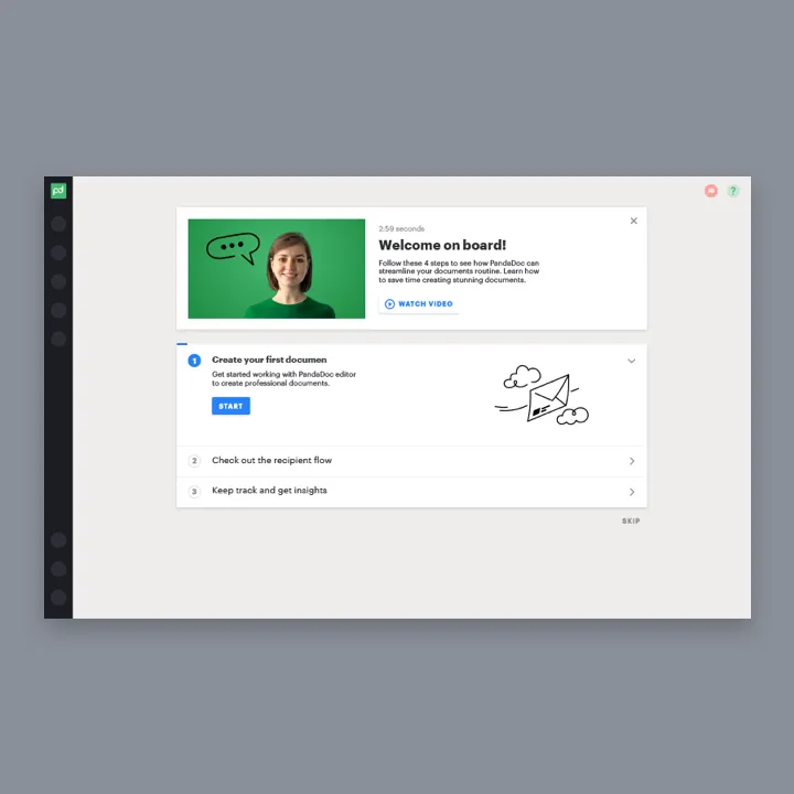
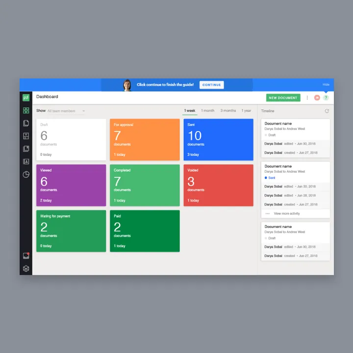
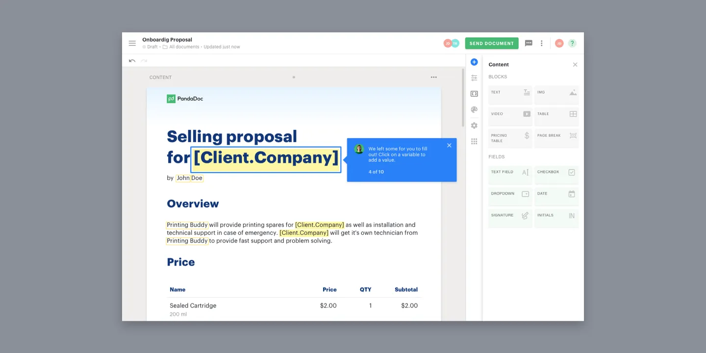
From analyzing users’ behavior and talking to our support and sales teams I learned that the user is overwhelmed by information right after the signup. So I made a concept with three easy steps: 1. Learning how to prepare and send the document. 2. Seing what the client will get. 3. Checking the analytics after the document completion. Thus providing easy-to-learn lessons with a short feedback loop.
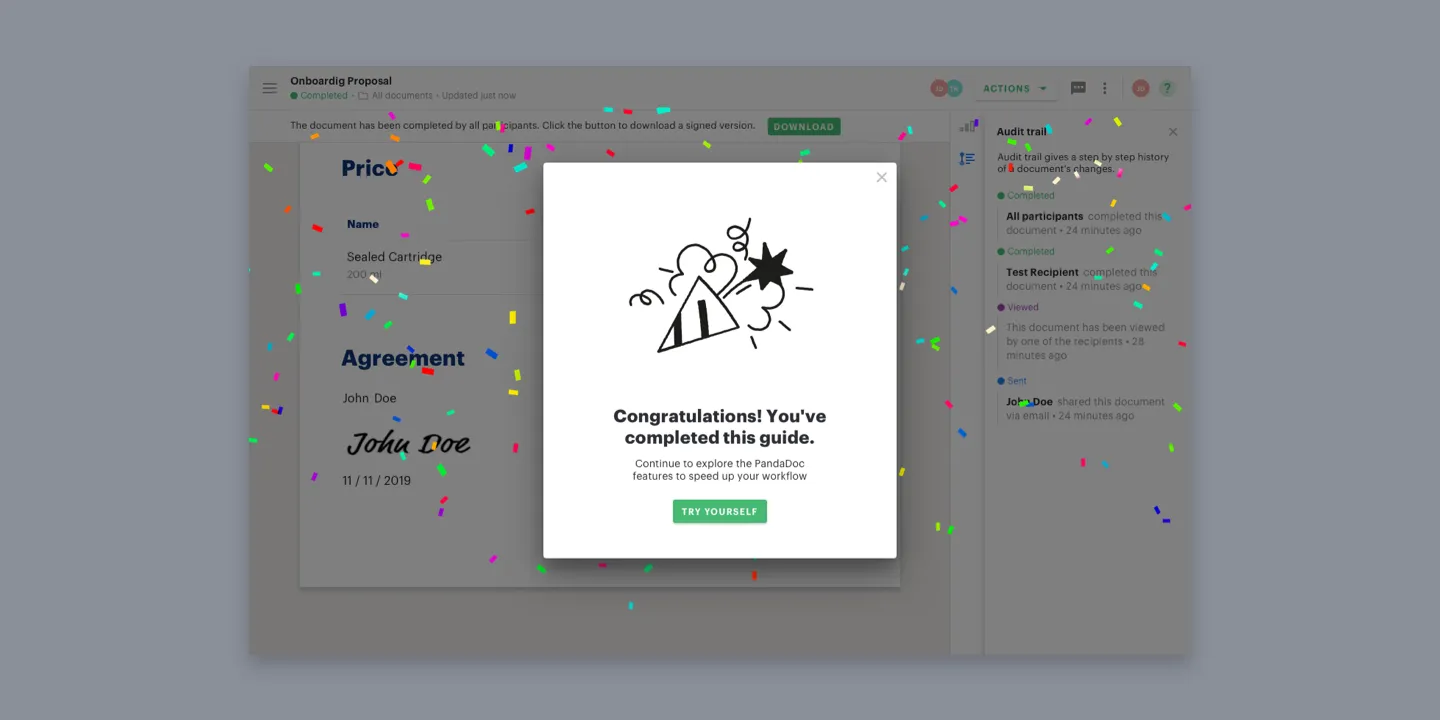
Also, I used human touch as I knew that it grows our user’s success across the product. And used tooltip guides to prevent users from clicking around and quitting the tour, as they tended to do in our previous onboarding. Progress bars and step counters to increase predictability weren’t forgotten as well.
During this task, I made 9 different onboarding flows which were tested within the company with the units’ leads, support, sales, and CSO teams. During that time I got important feedback to add 2 more flows, that cover different user expectations and got a lot of ideas for for this onboarding as an ultimate learning center.
When the design phase was done our unit changed the vector as we realized, that we didn’t have enough time to implement the onboarding before the next big project. So we decided to cut additional flows and release the shortest one.
Experiments
Delivery Club App Redesign
Delivery Club is a Russian food delivery service. I got there after the project I was working on was acquired by Mail.ru Group and became in charge of all of the product design. We pushed the project from a $100,000,000 valuation to $1,000,000,000 in a year.
Details
App Redesign
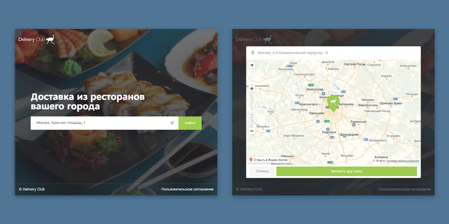
Problem The users couldn’t find restaurants and meals, the flow was unpredictable, there were no order status, delivery service, and support was poor. They usually ordered in big and well-known fast food restaurants, as the product was associated with junk food-oriented apps. This slowed down the app’s growth.
Approach
- Simplify the range of restaurants and meals reducing the order time;
- Increase user retention by adding a loyalty program, making the experience clear, and predictable;
- Experiment with new functions, and A/B test as much as possible.
Improved
- List of restaurants
- Restaurant screen and menu
- Cart and checkout
- Order status
- Reorder and favorite restaurants
- Takeaway
- Other
Result
- Number of loyal users ↑×2
- Number of their average orders ↑×2
- Conversion ↑34%
- Retention ↑23%
- Crash rate ↓83%
- 15 iOS versions
- 12 Android versions
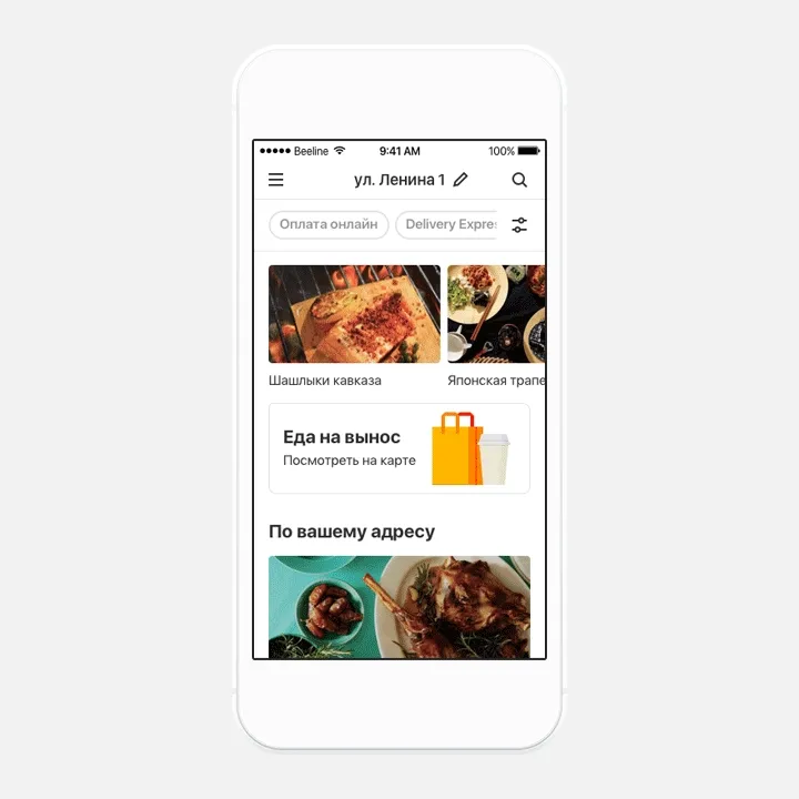
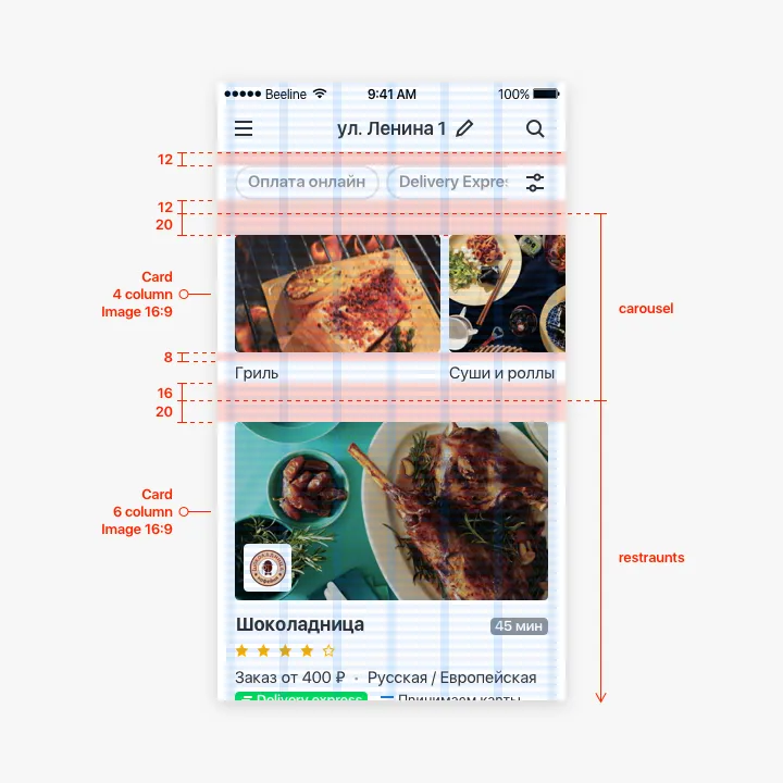
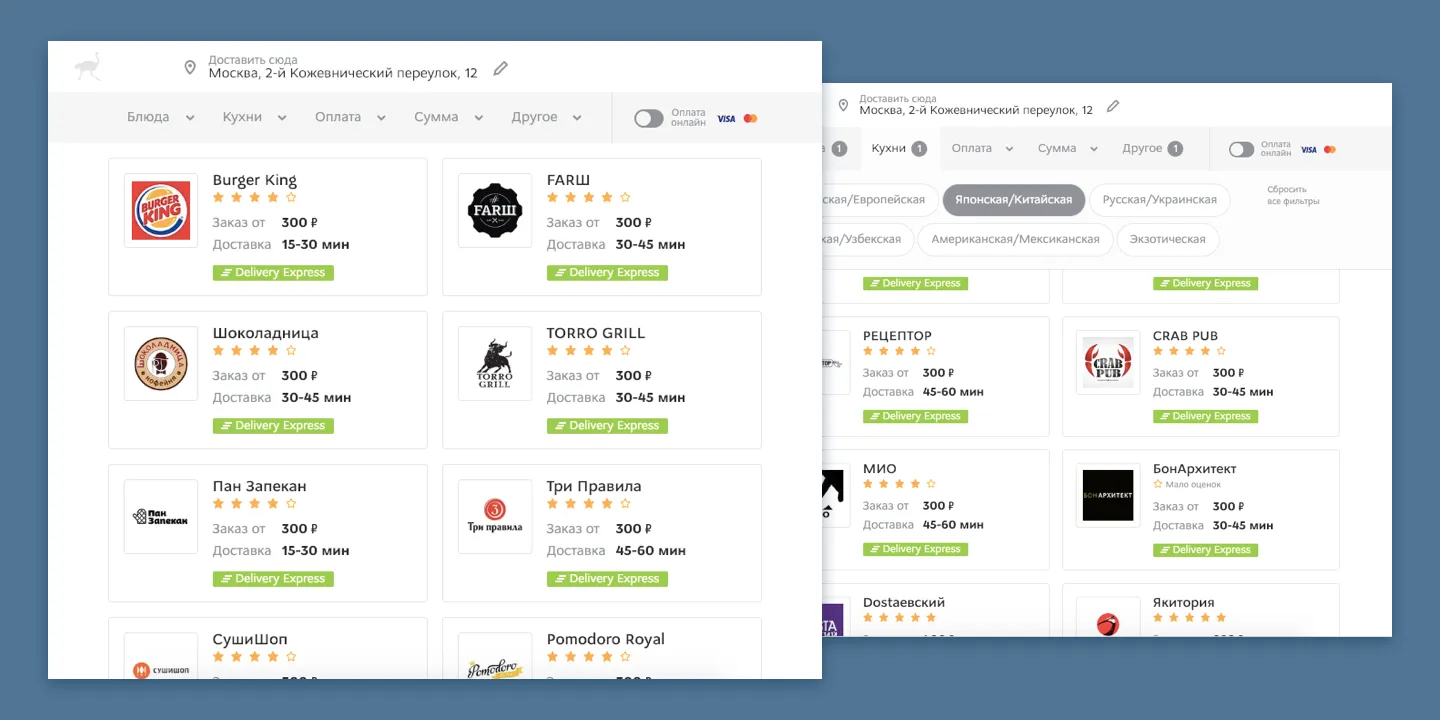
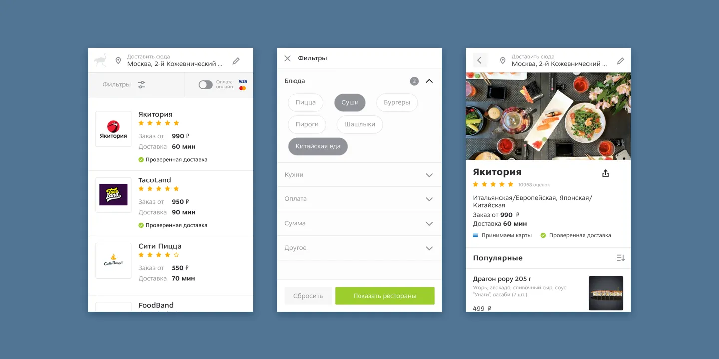
List of Restaurants
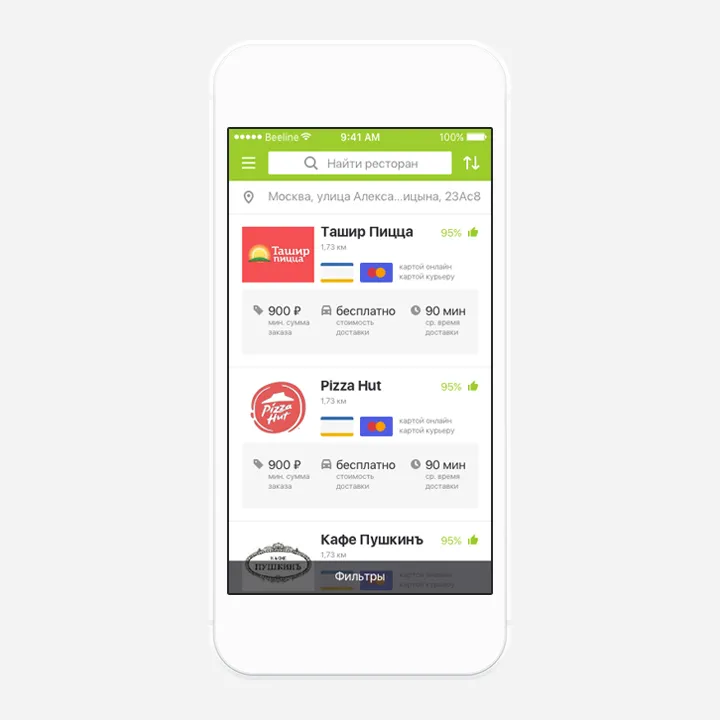
Focus on restaurants. For big cities we photographed restaurant meals, thus users could search faster for a specific cuisine. The emphasis was shifted from a brand to its food. Address, search, filters – all in one place. To facilitate user searching and ordering, the restaurant product range was increased. As some users ordered in the same restaurants each time, we added the Add to Favourite function to search faster. When the user address and location were different, the notification appeared. This way we reduced the chances of a wrong address delivery.
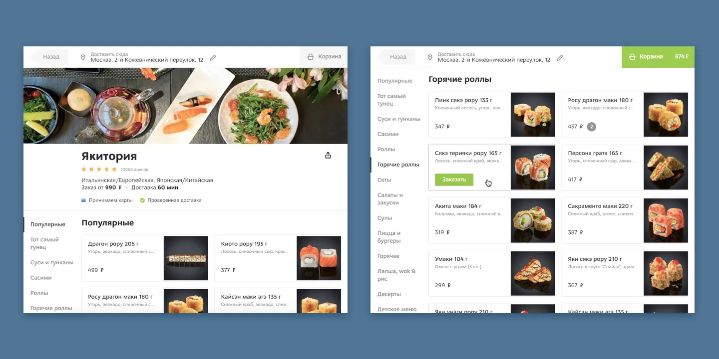
Restaurant Screen and Menu
The cart was hardly noticeable at the top of the screen. The menu was made of dropdowns inside of dropdowns, so the search was difficult. Navigation looked like a different screen, so when the users pressed Back to go to the top of the screen, they left the restaurant instead.
We added an option to repeat the previous order. The menu became a continuous list with a function to move to its specific parts using header tabs. The cart was under the thumb with useful information, if needed.
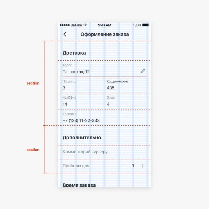
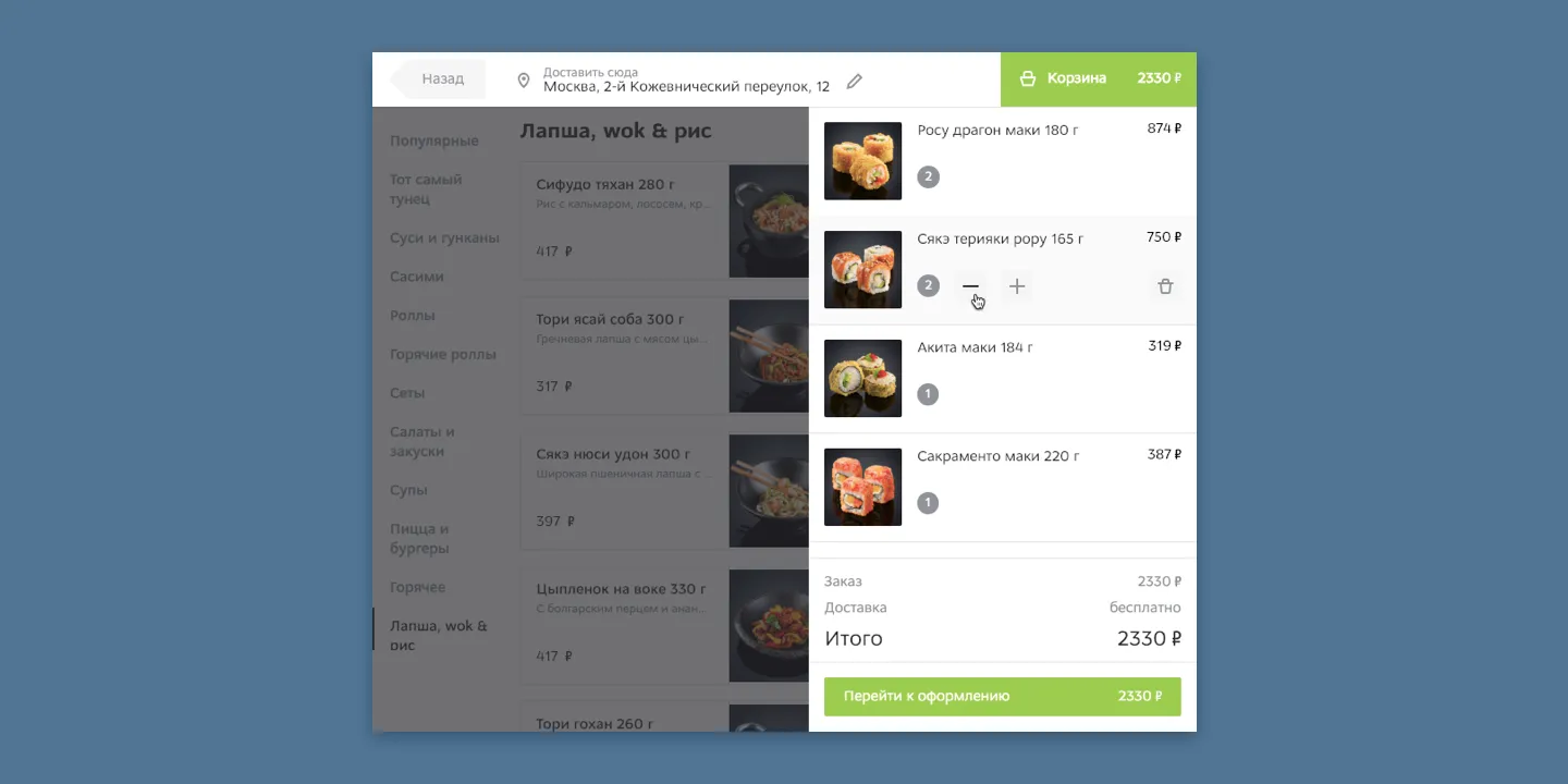
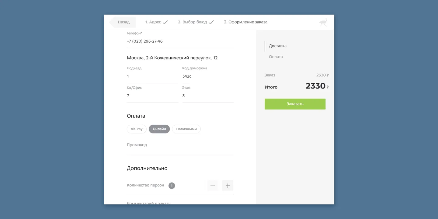
Cart & Checkout
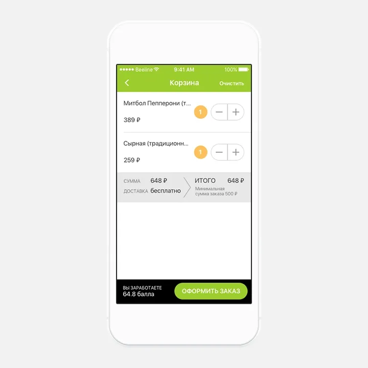
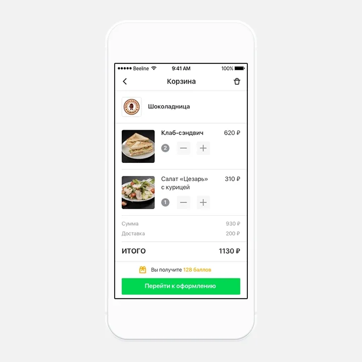
The cart had no images, which was a problem for people, who tried to order non-Russian cuisine. They simply forgot, what the item was, and couldn’t identify it by the title. Moreover, checkout took too long and was ambiguous.
The new cart had images, and users loved it. Also, it had a restaurant’s logo for the users, who came to cart via a link or reorder. Logo helped them return to a menu, and add other items. Checkout was cleaned up, and new payment methods were added. Of course, our goal was to merge the cart and checkout, but we had to implement it through evolution, not revolution.
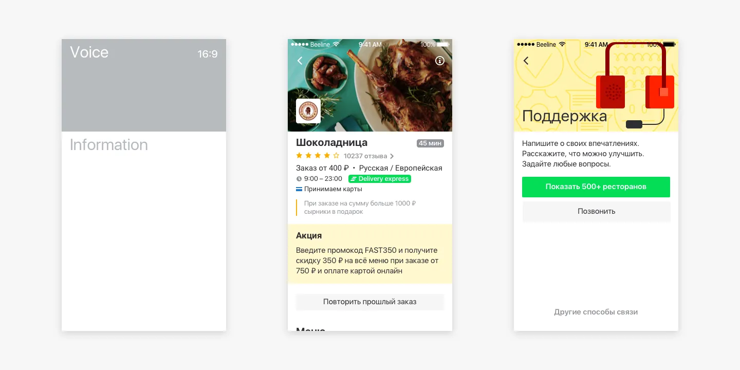
Order Status
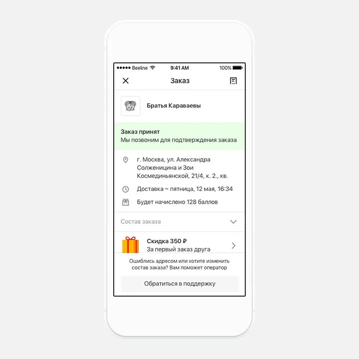
The screen didn’t give users much useful information, so they felt frustrated about their order status. It made the experience unpleasant and was one of the reasons of re-ordering lack.
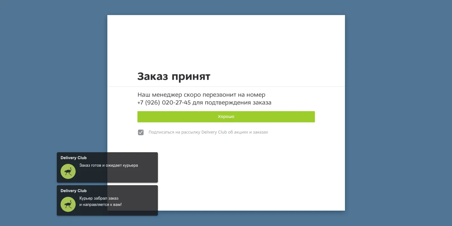
As we couldn’t technically provide a position of the order on the map, we showed the order info again and added the Contact support button. Thus, we reduced wrong address delivery even more, because the users could contact support, and cancel the order. Also, there were statuses like «Order is being prepared», and «Order is on the way», so the users felt, that everything was under control.
Reorder
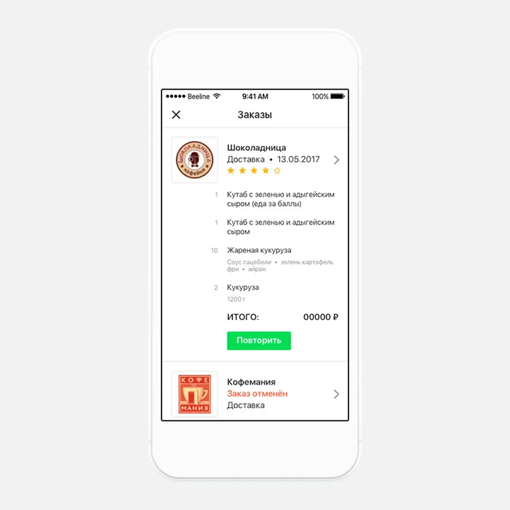
Despite helping the users to discover new places, there was a group, who ordered the same items in the same places. To improve their experience, we added a reordering feature. We created an order history screen, where all the carts had a list of ordered items and a reorder button.
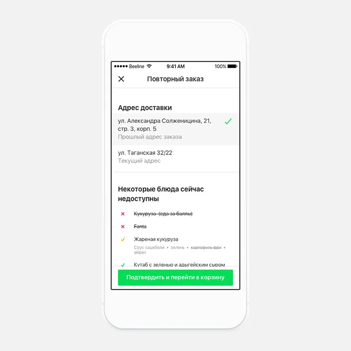
When the user pressed Reorder, they proceeded to a review screen with the address, and the list of items. As for the previous time, the user could order from a different place, and some items could be out of stock in the restaurant. If the user pressed OK, he proceeded to a cart, where he could go back to the menu, and add more items.
Takeaway
The team wanted to make it without a map, due to speed, and easiness of development, While, my concern was the low customers’ willingness to use it. That’s why, I made a prototype, that convinced the team to implement a map.
To invite users to check the feature, we added a takeaway thumbnail on the main screen and provided with a simple onboarding. The implementation was simpler, as we didn’t draw the path, because we wanted to test the feature in its basics. It was released, but after 3 months, the feature was shut down due to low usage.
In General
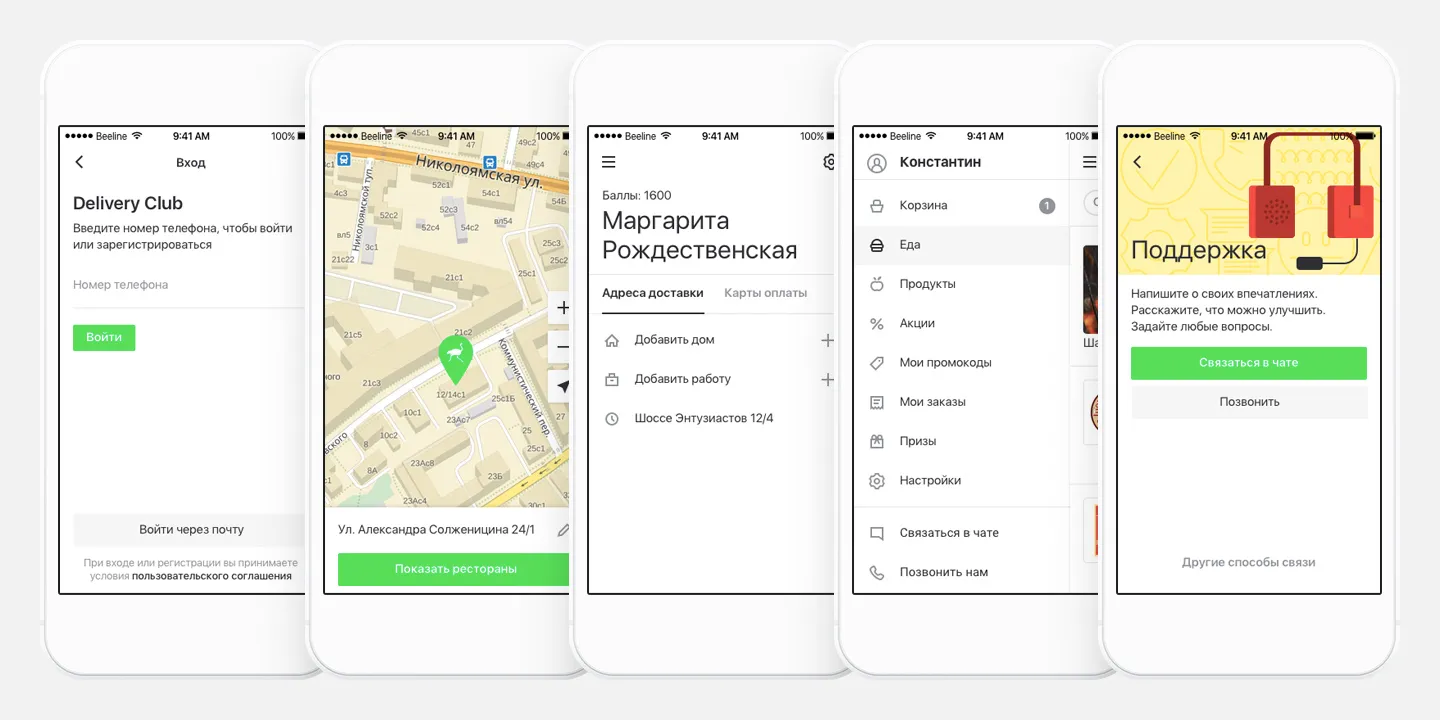
Also, we added login via mobile number, improved address selection, and added favorite addresses there. As the users mainly ordered in 2-3 places, we redesigned the user’s profile. Also, we made the look of some screens corresponding with the new design, and the whole communication friendlier. In total, we redesigned around 700 screens of iOS mobile app, Android mobile, and tablet apps. The app was repeatedly featured in the App Store and Google Play.
Delivery Club Design System
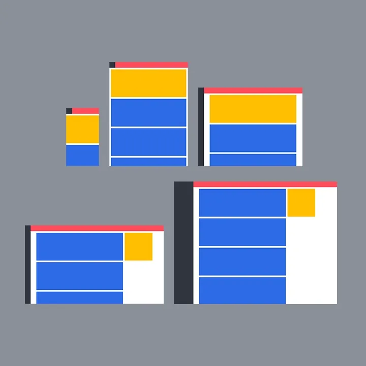
As the process of development was rapid, the need for «building blocks» was obvious. Also, it was clear that when the design team increases it will be harder to maintain a consistent look and to keep the same development speed. That’s why in my spare time I made the design system.
Details
Basics
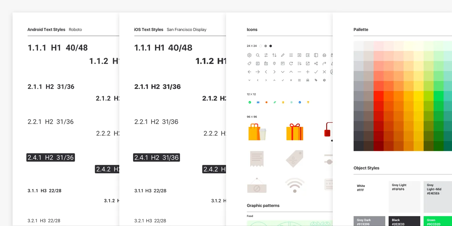
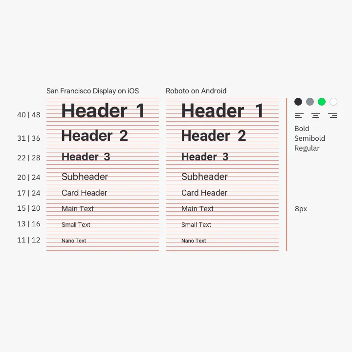
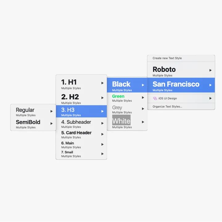
The height of the main text was 8px. Other styles were obtained by upscaling and downscaling it using the Perfect Fourth ratio and then tweaked to look well in the UI with the 8px paradigm in mind.
Every case of text style usage was integrated into working files, to create limitations for keeping styles coherently over time. Also, to make their usage easier and more adaptable for the new team.
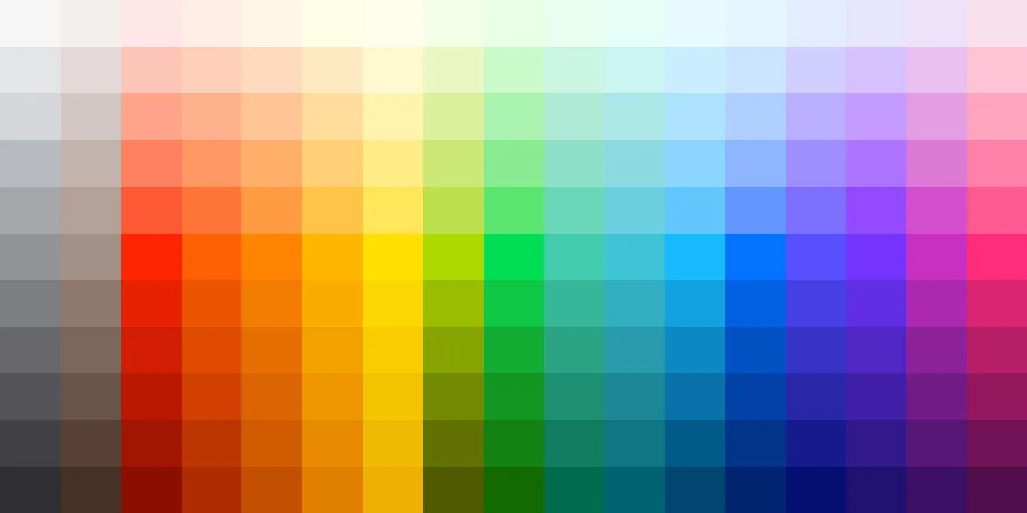
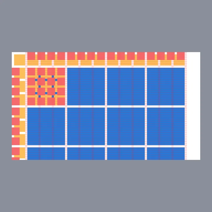
We needed a contrast color palette to minimize color decisions. For better understanding, I researched cartographers and graphics data papers. This way main, light, and dark colors were picked in the CIE-Lab color space using a chroma.js picker. Here, each column was interpolated vertically with Chroma.js Color Scale Helper, and then the whole palette was interpolated horizontally to balance color distribution.
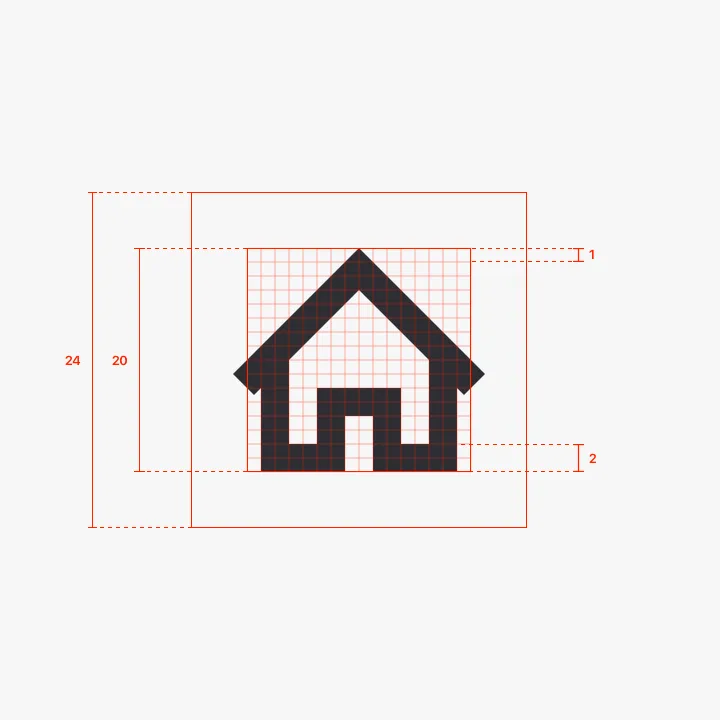
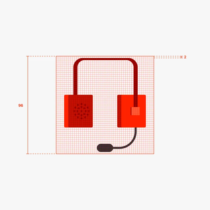
72 icons in total. Each has a 24×24 px base, 20×20 px safe zone, and 2 px grid. 96×96 icons were used in communication. Each one had a grid and no safety zone.
Patterns made the product look less boring. They had three levels of detailing: 1) Background color, which defines mood. Green – everything is fine, yellow – something went wrong, and red (we never used it) – everything is bad; 2) Pattern style that reflects its context usage i.e. food, delivery, etc. 3) An overlay illustration (optional) made the message more precise.
Beauty was sacrificed to speed up the production of the tiles so all illustrations were applied onto an 8px grid.
Components & Layouts
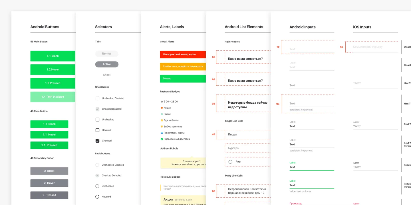
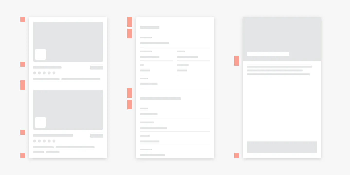
All components were made to maintain the same optical margin everywhere and double it if needed to maintain constant rhythm over the app.
I took the concept of a list as a basis, so all the elements are components of the list. This lets most of the screen be multivariate and modular without worrying about wrong margins.
Besides list screens, we had screens to communicate with the user. Restaurants translated their voices with food photos, and we translated our voices via our patterns, colors, and illustrations.
All above was applied to Android tablets as well.
Delivery Club VK App
A lot of companies had their pages on VK – a popular Eastern European social network and could offer their services right from there. As there were no food delivery apps, we quickly created one to provide with better food delivery experience for VK users.
Details
The users could watch shows, play games, chat with friends, as well as order food, and get notifications about order status right in VK. With this project, we got a chance to engage new users and overhead competitors on the new platform.
Before Starting
Every VK app is integrated via iframe, so we decided to make it light without relying on additional JS much. Also, we were making it responsive.
My intent with this project was to do design research for the upcoming Delivery Club website redesign. I tried to extend a mobile design system by adapting it to bigger screens, relying on existing components.
How would we get users
Both VK and Delivery Club were part of the Mail.Ru ecosystem, so getting new users was just a matter of promotion in the right user segments inside VK. Our partner restaurant could get their version of the app with their menu only, so we could obtain users from their pages as well.
The Flow
A typical user flow was: 1) Set an address → 2) Choose a restaurant → 3) Pick items → 4) Inspect a cart → 5) Checkout → 6) Success → 7) Get order status notification. We wanted to rebuild it and tweak it if needed.
Setting an Address
By default, the users are to type the address, because we assumed that letting the app check their geo position via native dialog could scare them. Also, they have an option to choose the address on the map.
Restaurant Selection
The restaurant list was formed by algorithms on the backend across the product. This way, users saw the best restaurants first. Criteria were rating, delivery time, failure rate, etc.
Restaurant Screen & Meal Selection
Here, we used a big photo of restaurant meals to provide the users with more information about the place. Other information from the mobile app version was available as well.
To navigate the menu, the user could scroll it or reach its specific parts with an index from the left side of the list. The user could add more items to the cart right from the menu list or open an item cart with additional information, and add it from there.
Inspecting the Cart
The product director didn’t want to merge the cart with checkout. He found it too risky at that time. Thus, I coped with the task by adding the cart to the side of the screen, overlaying the content.
Doing so, we made the customer flow more consistent, because we didn’t separate their mental model of forming an order by two different screens. The user could form, and check the cart within a single context.
Checkout
Here, we just copied everything from our mobile app checkout. My main focus was to figure out how everything should work on the web forms of the product, and what sizing should we use to stay consistent across all platforms.
Success Screen & Notifications
After placing an order, the user gets a success screen with instructions. There are notifications right from the VK interface. This is very handy, especially if the user is watching shows on VK, for example.
Design Process
The app could be opened on mobile as well. Thus, everything was made responsive matching the good old 8 px paradigm.
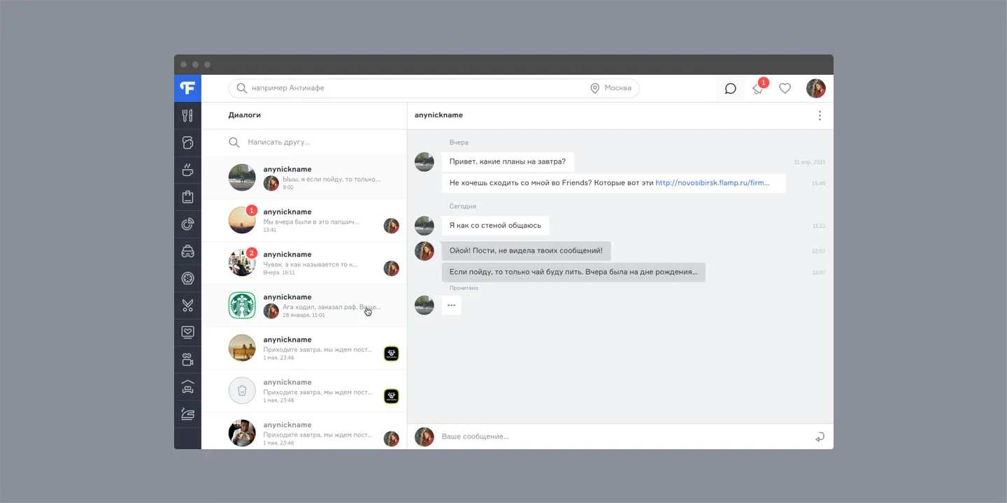
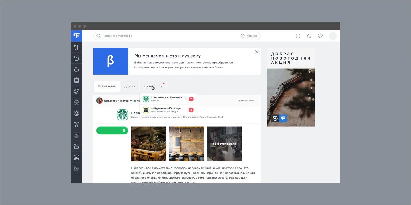
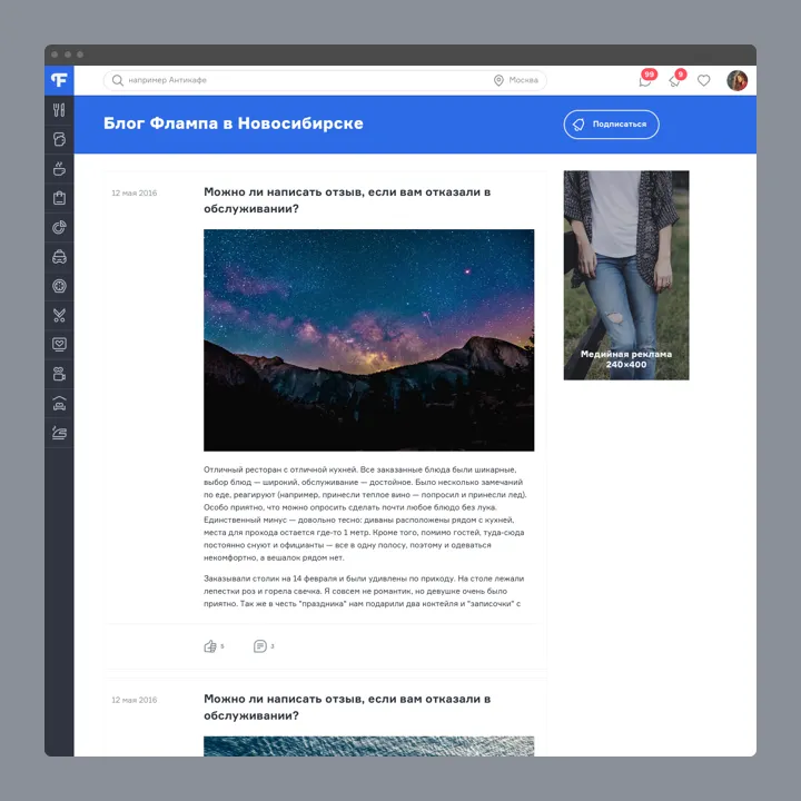
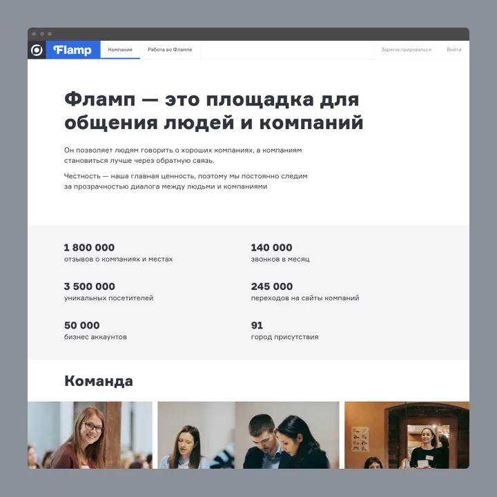
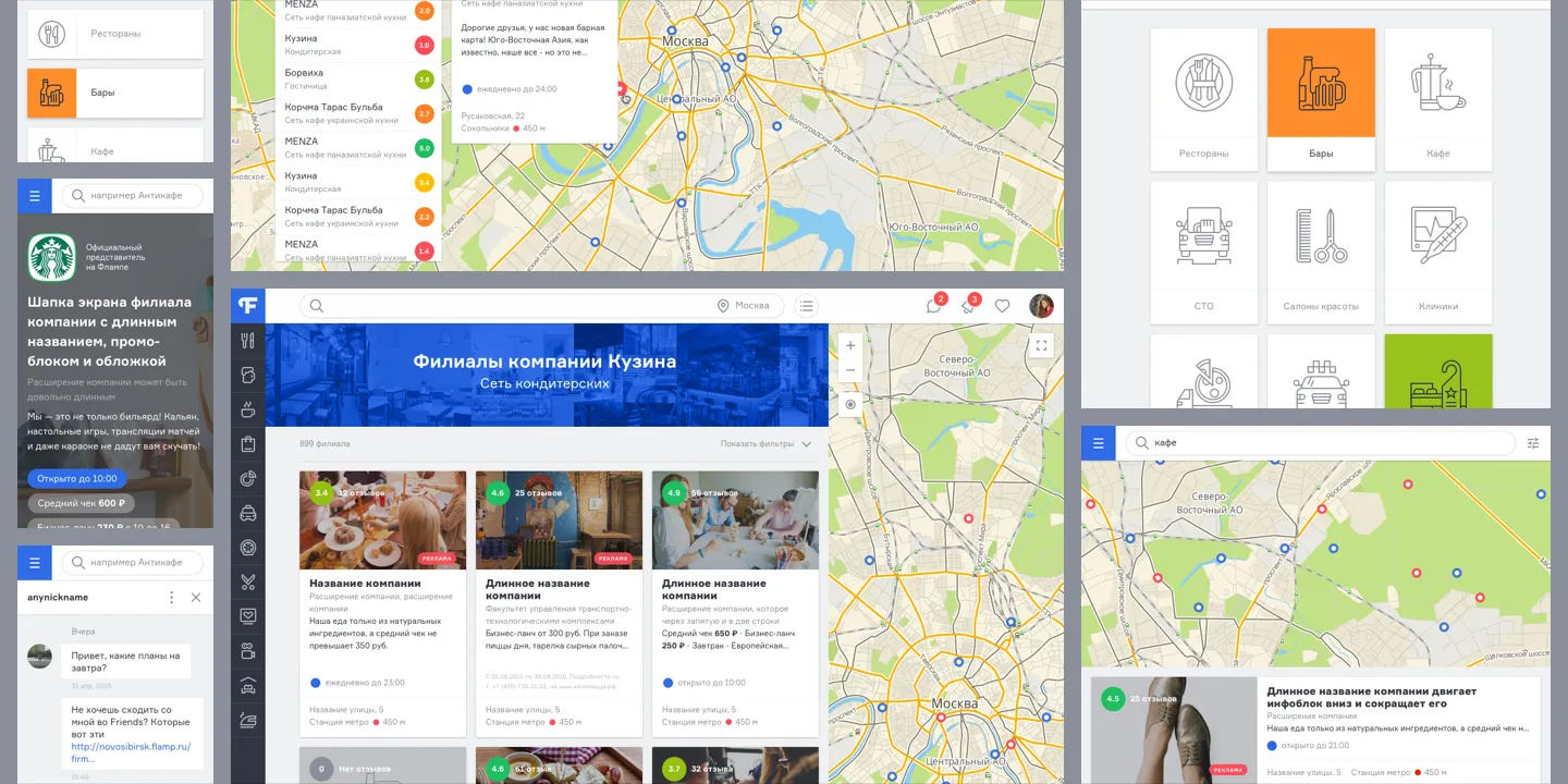
Flamp
Flamp is a review service that is popular in Russian regions. To gain more audience in Moscow and Saint-Petersburg, the company decided to develop a new brand and digital appearance. I was lucky to design a new website.
Details
Landy
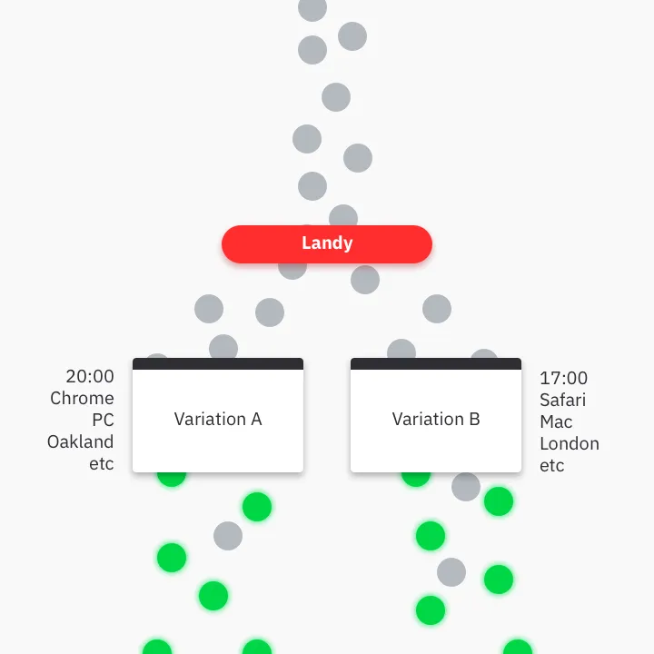
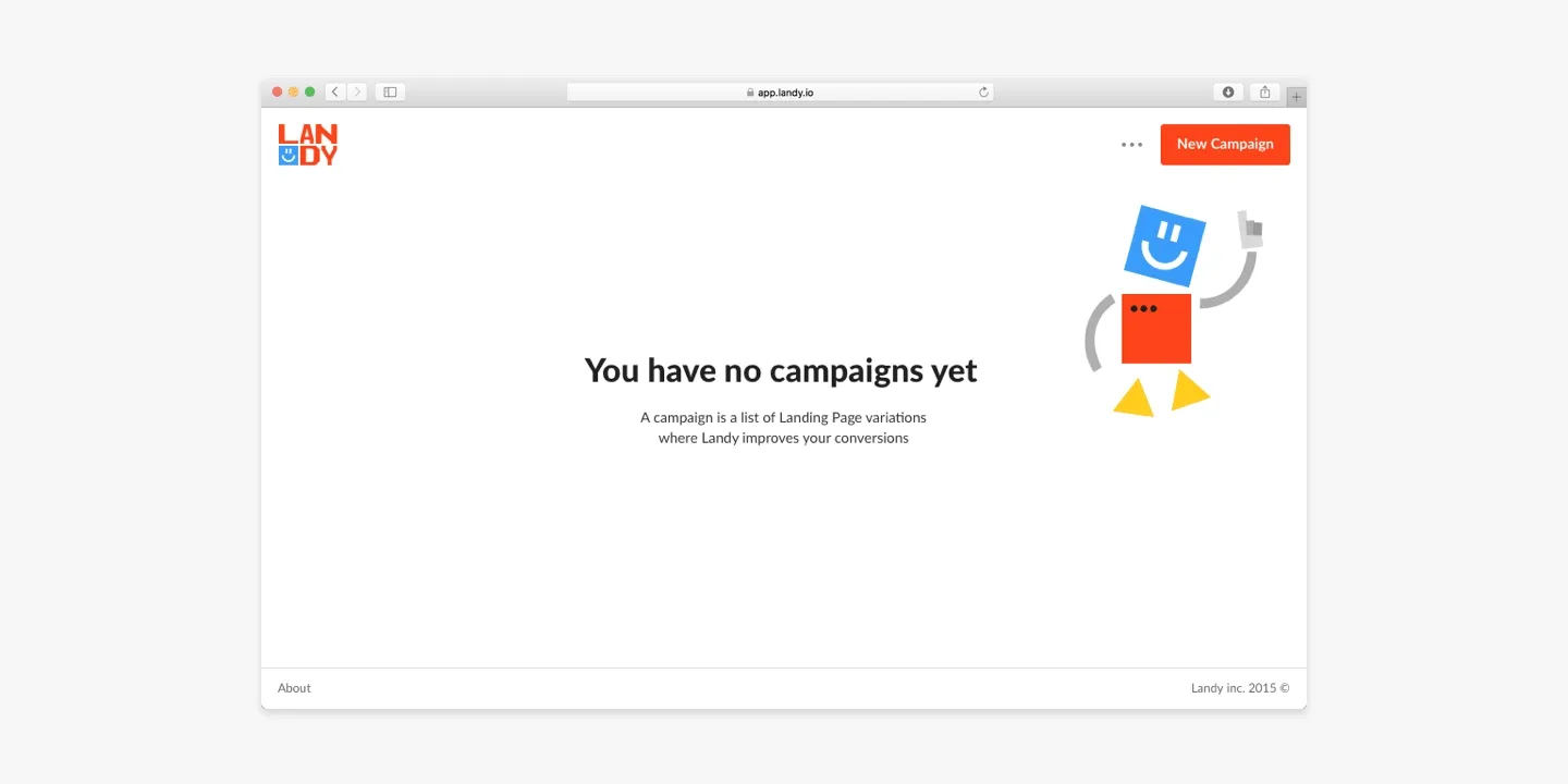
There must be personalized communication with every user. However, a single landing page provides with limited communication, so a message may be misunderstood. Thus the company may lose its potential customers.
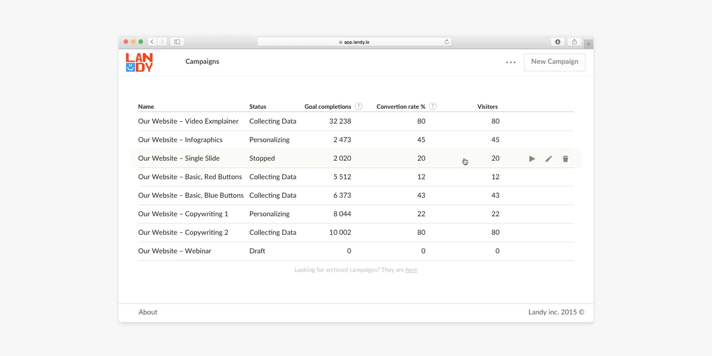
To help companies communicate better, we have built Landy, which lets business owners clone, and customize their landing pages, and put their growth on autopilot, by suiting specific variations to a specific group of visitors via AI.
Details
Logo
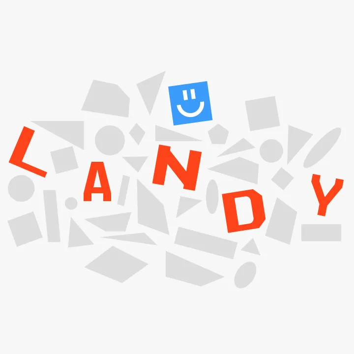
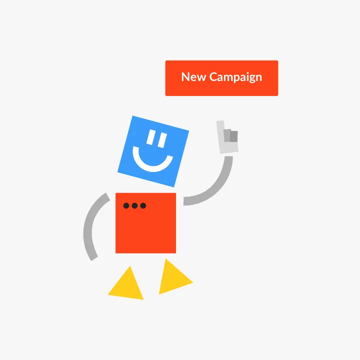
We were building an automated assistant-like tool, kind of a robot. Thus, we chose a robot as the main metaphor. As long as it had to deal with landing pages, and decide where to land a user, we picked the name «Landy». We made a logo and built all communication around this metaphor. Typography reflects the idea of constantly changing elements on web pages.
Web App
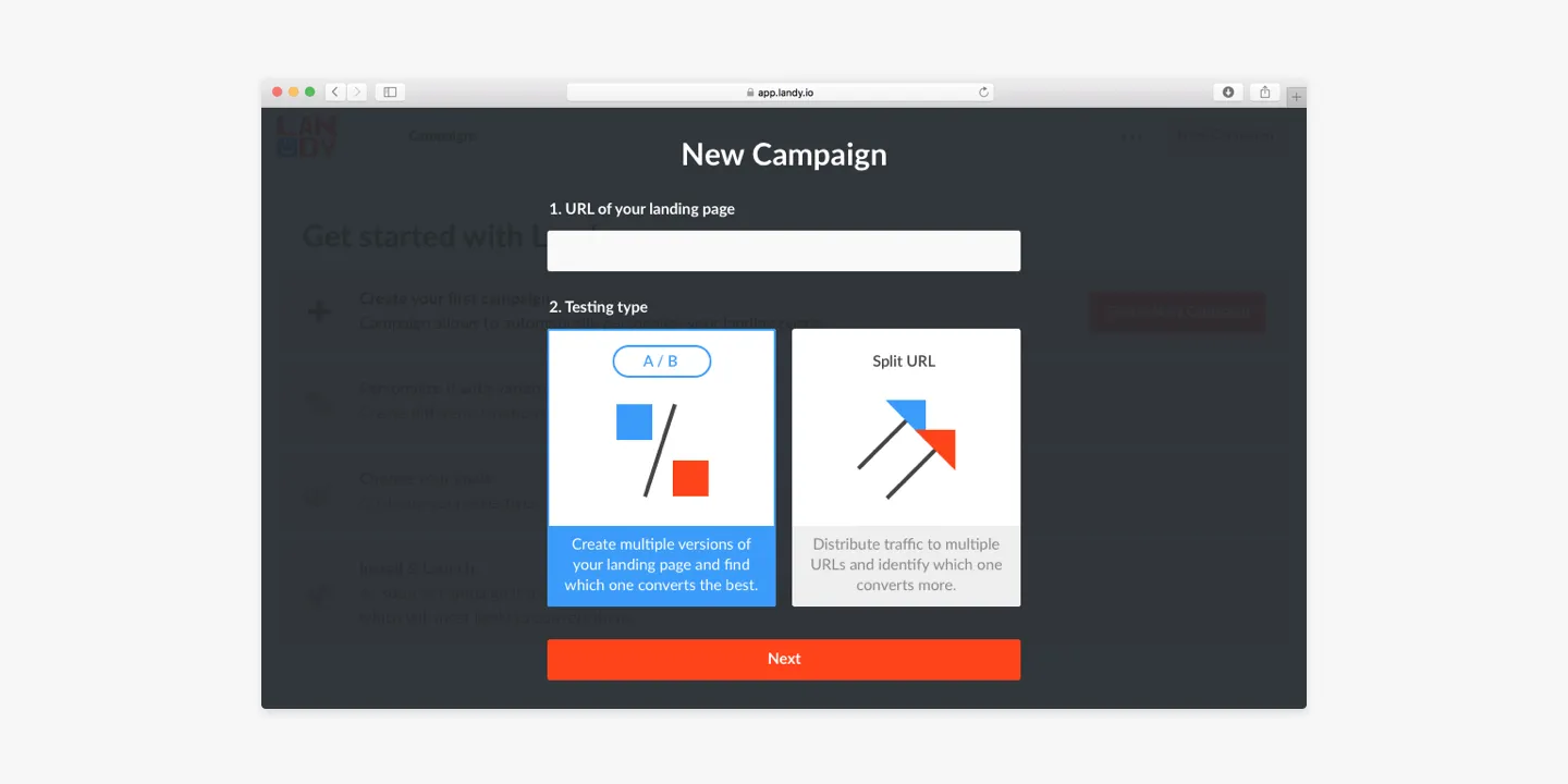
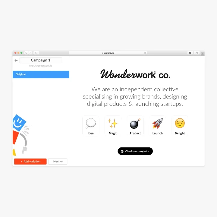
Landy founder Dmitry Tsepelev had a marketing background. He also researched existing solutions and interviewed its users. That’s why his view on MVP was clear and accurate
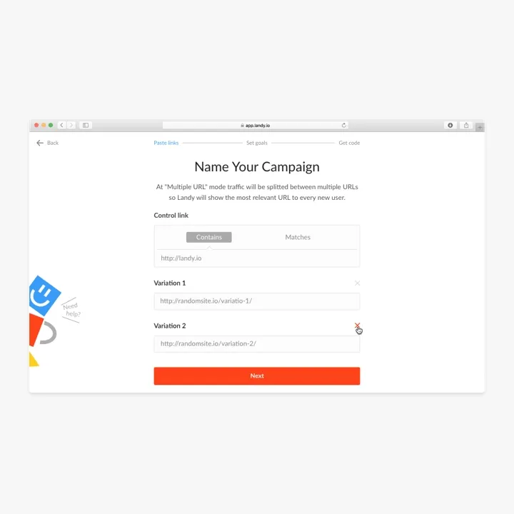
User pastes a link to the website → Duplicates it, and creates variations → Sets goals and launches the campaign. Landy: Learns about its users, and grows the conversion
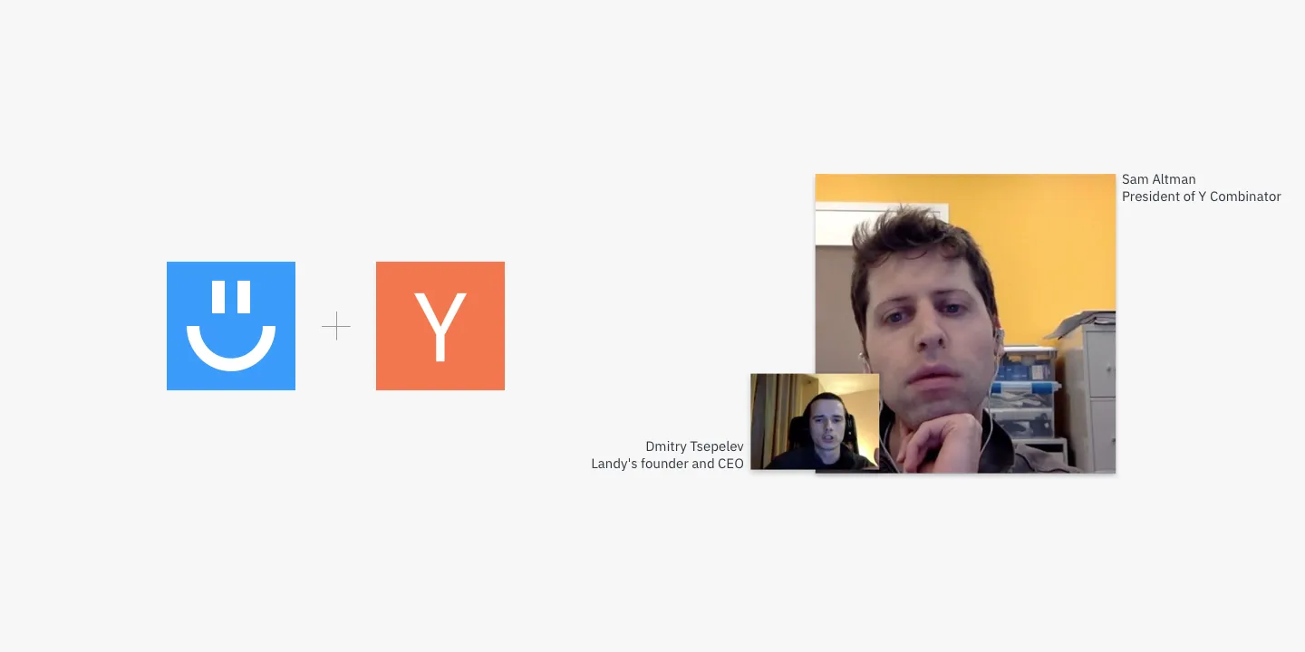
YC Open Hours
Landy was selected for the YC Open Office Hours program, and we were lucky to get Sam Altman as an expert. While it was not the main YC program, it is still around 1000 startups applying with only 40 selected. That’s why we were so thrilled to get such an opportunity and happy to receive positive feedback from such an experienced expert like Sam.
Despite the fact, that in the end, we found automated personalization is still not the thing that is badly wanted by every other company, it was a great journey from all possible prospectives. We learned a lot about building a product from scratch, communicating with users, collecting feedback, marketing our product, iterating, and making a design decision based on collected data.
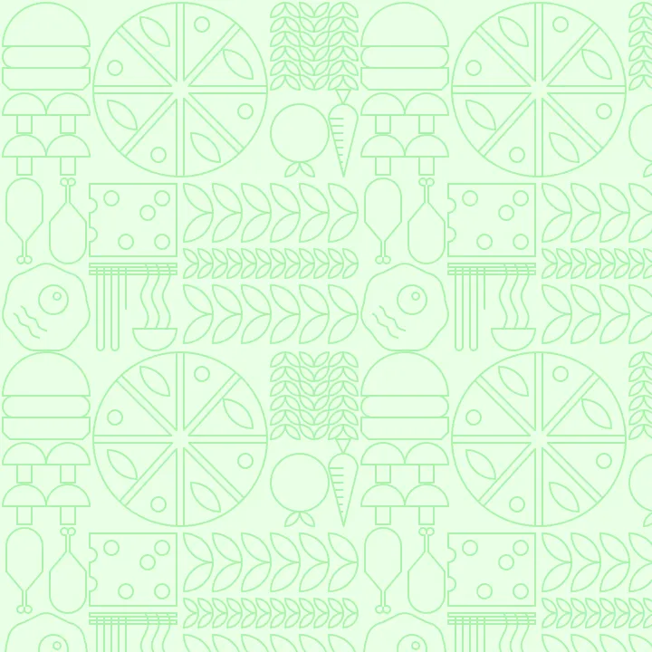
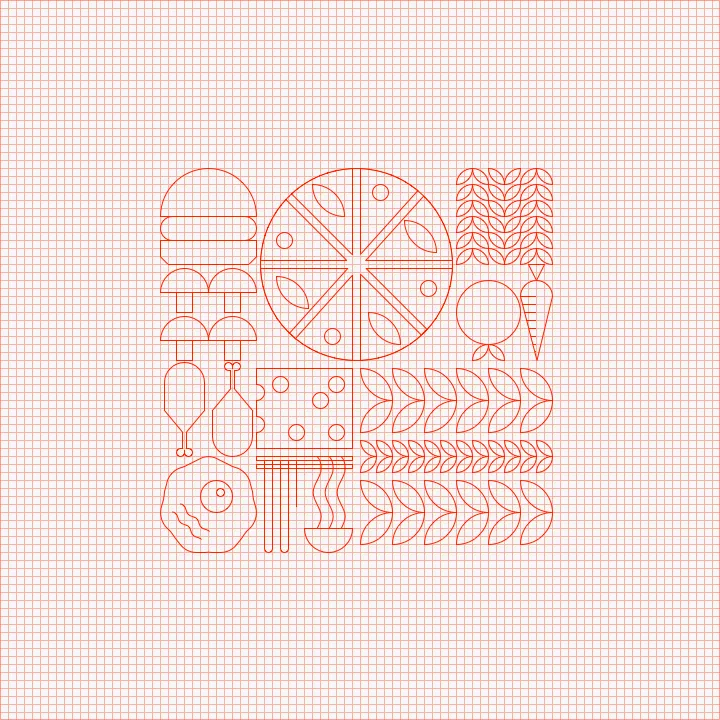
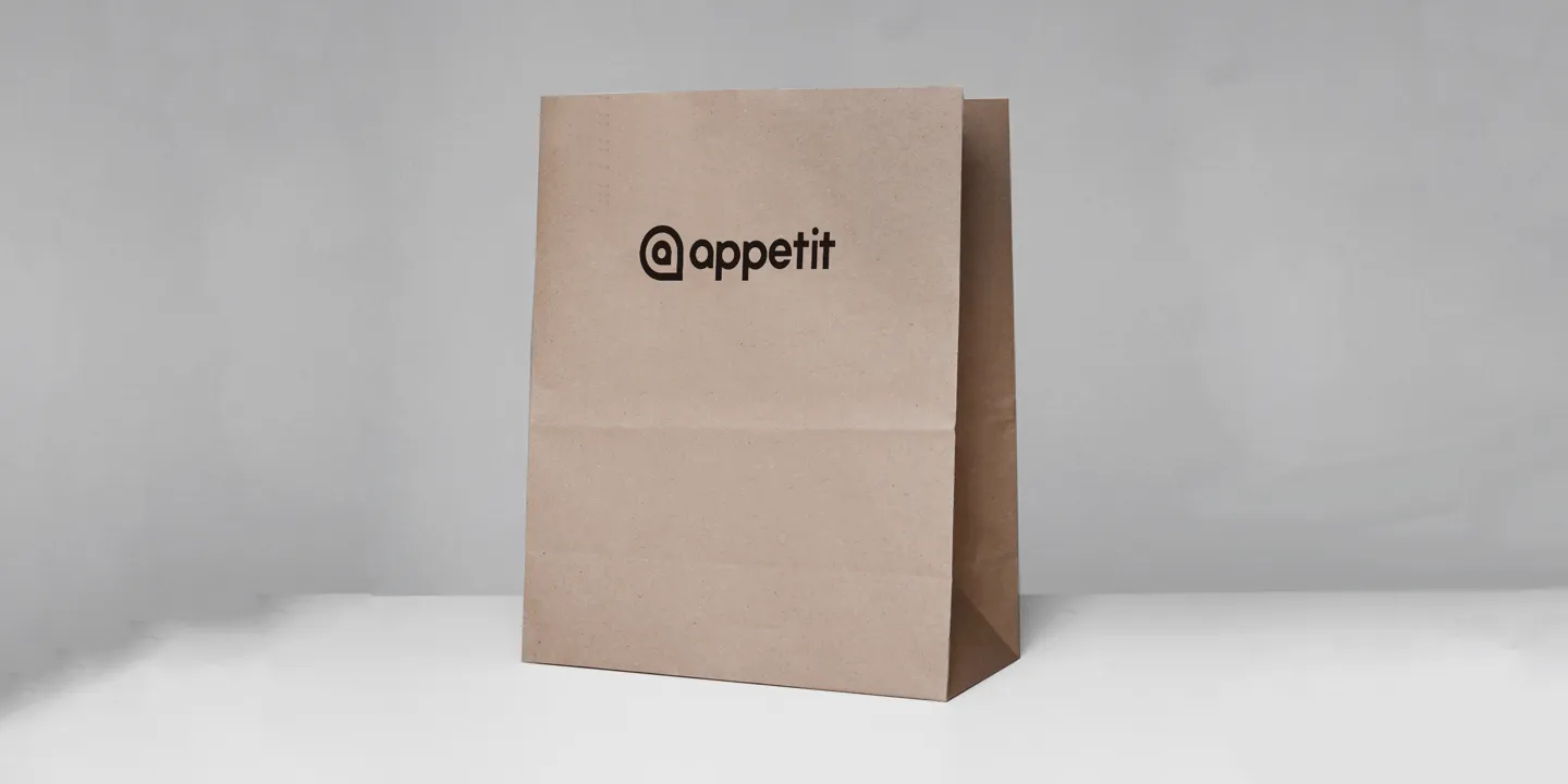
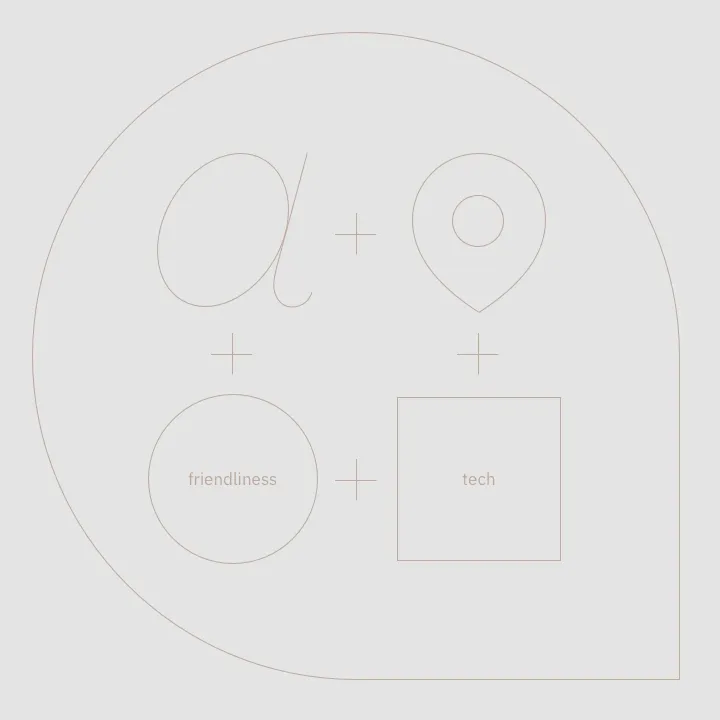
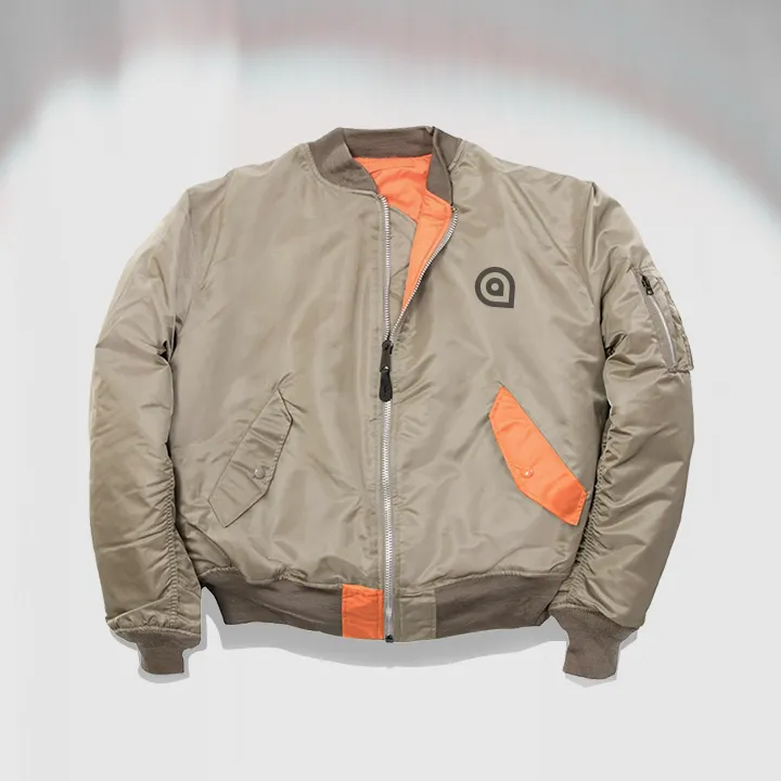
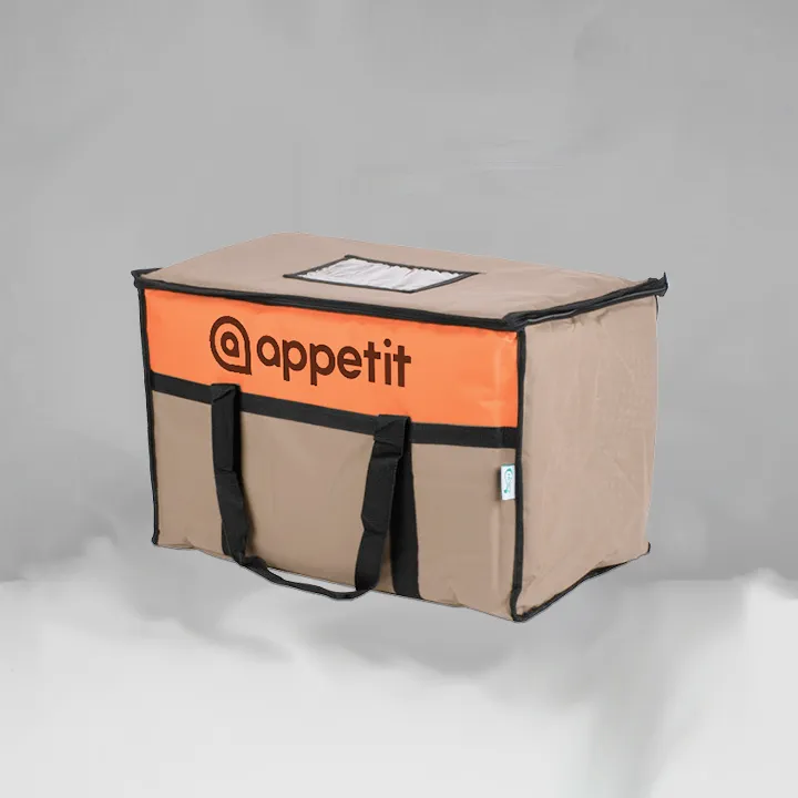
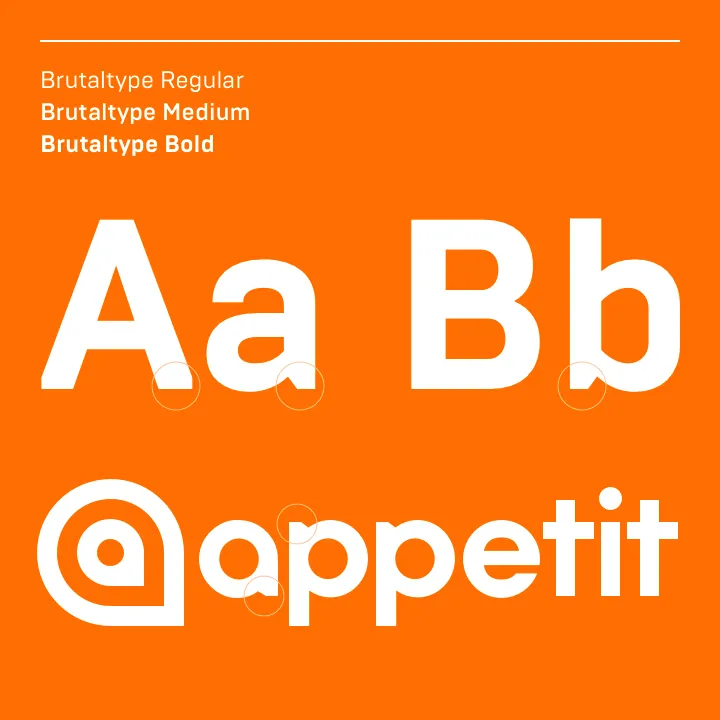
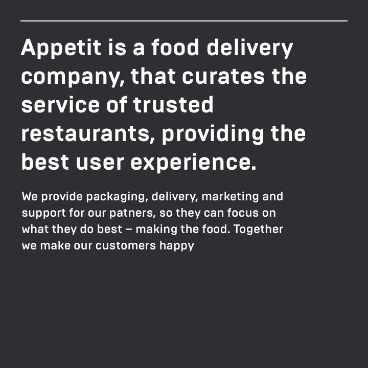
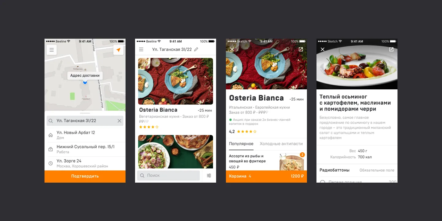
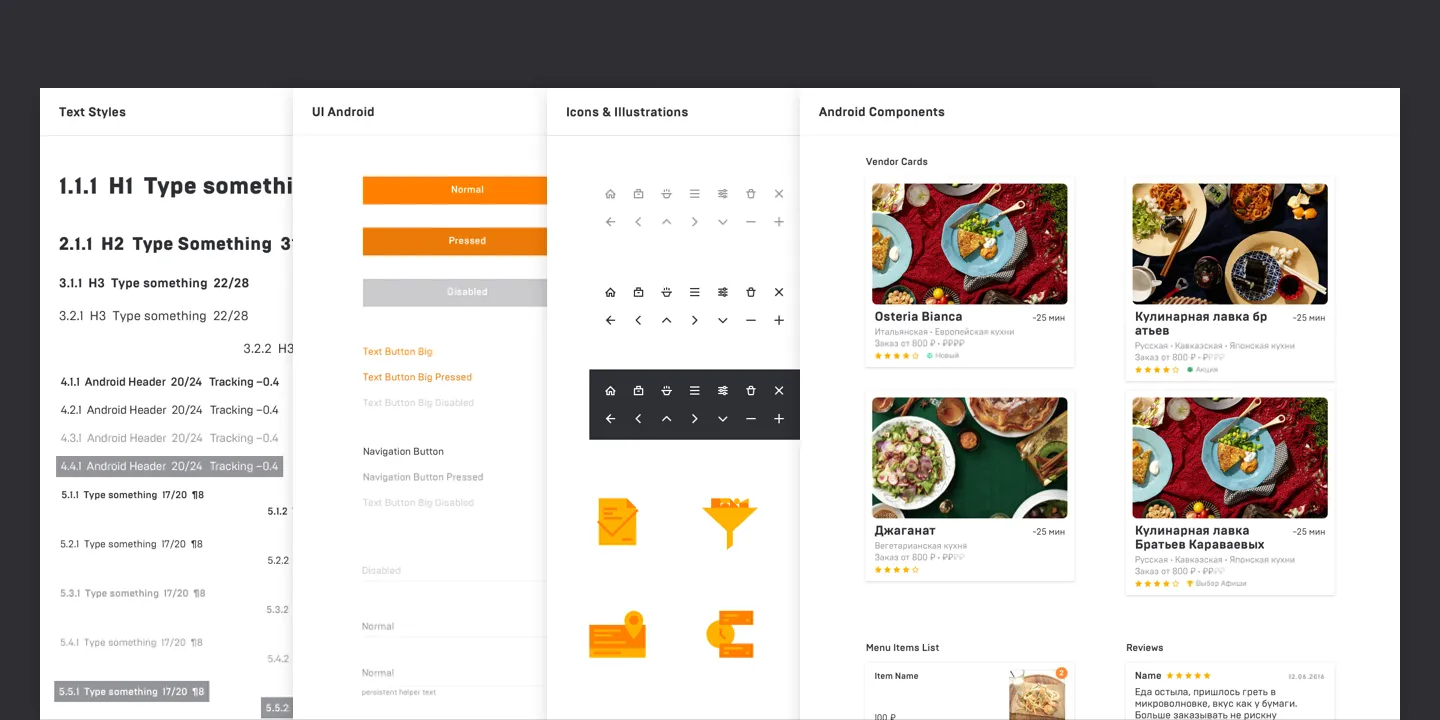
Appetit
Food delivery company from scratch.
Details
Identity
Typography
App
Lebedev Studio
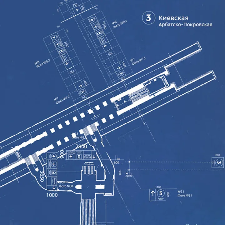
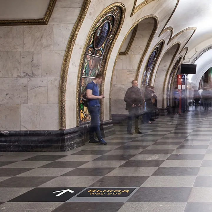
My first design job where I learned how to design and build websites, and where I also co-designed and co-led the implementation of floor navigation for the Moscow subway.
Details
Moscow Underground Floor Navigation
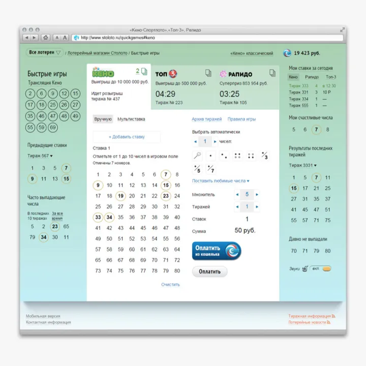
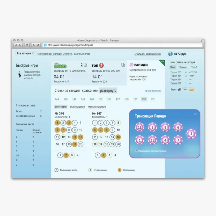
Stoloto Quick Games
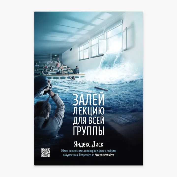
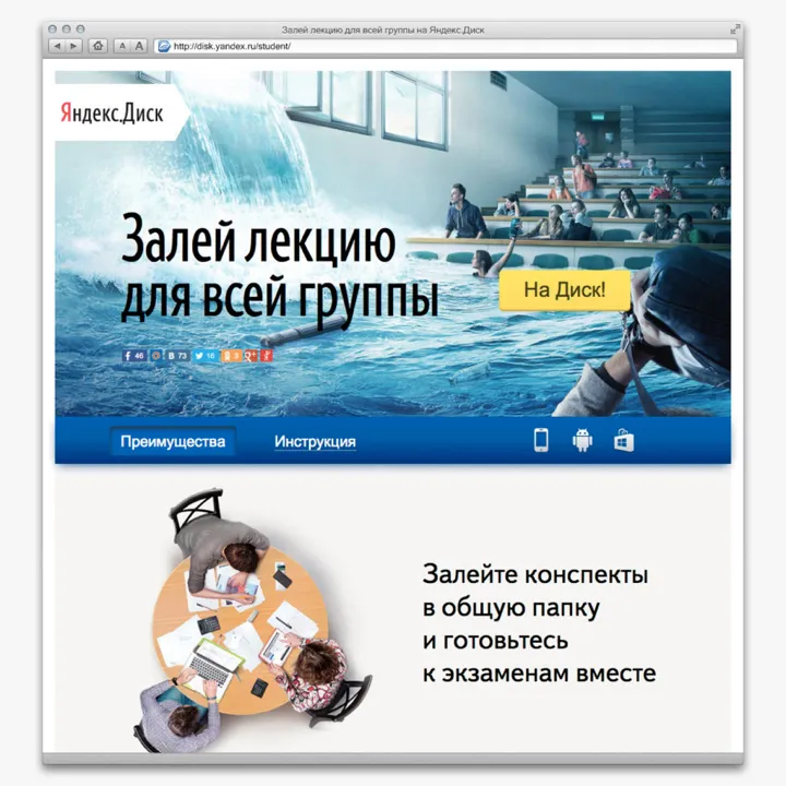
Yandex Marketing Materials