NetBeez is a network inspection tool backed by YC.
I have enjoyed developing the plan for its redesign and overseeing its implementation, collaborating closely with the founders.
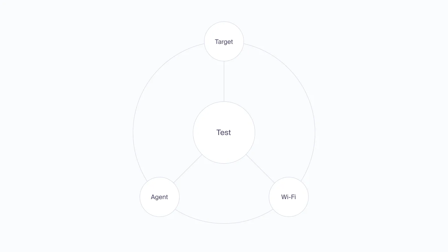
The service lets engineers investigate network issues by helping them create, run tests, and analyze results. This involves looking at system parts like Agents, Targets, and WiFi, considering how they interact with other network components.

After establishing a strong presence in the market and experiencing growth over the past decade, NetBeez approached O0 to create a new brand and landing page. Once it was done, they sought our help in exploring options for redesigning their product. That’s where my team stepped in, proposing ideas and forging a partnership.
Audit
We took screenshots of all the screens and assembled a map of them. Then we identified the main problems of the service, which were inconsistency in the behavior of similar elements across the service, and inconsistent navigation patterns. Additionally, while investigating, users could go so deep into the interface that previous context is no longer present on the screen.
This exercise also gave us a better sense of the number of individual elements to develop and an approximate time for it. It was bold to believe that we could do everything with such precision. However, no battle was ever won according to plan, but no battle was ever won without one.
Layout
So we knew that engineers needed to dive deep inside entities, go back easily, and be able to compare data quickly.

This brought to my mind the analogy of when you’re holding a book with footnotes on another page and you put your fingers between pages to be able to go back and forth and compare information quickly.
So I came up with this concept where during the investigation, users open a semi-modal overlay and are able to go deep there, or select another flow. This behavior makes it easy to compare data.
Visual Appearance
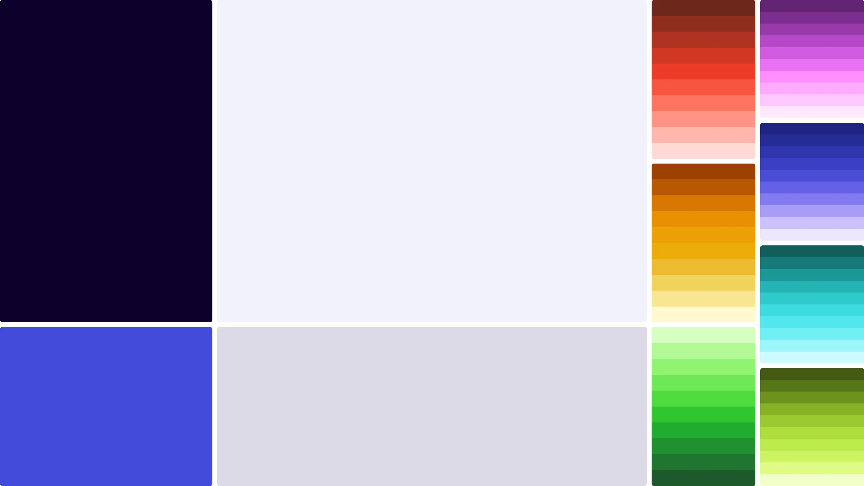
We extended our brandguide pallette with colorblind friendly colors which was crucial for the product with this amount of charts and visual data.

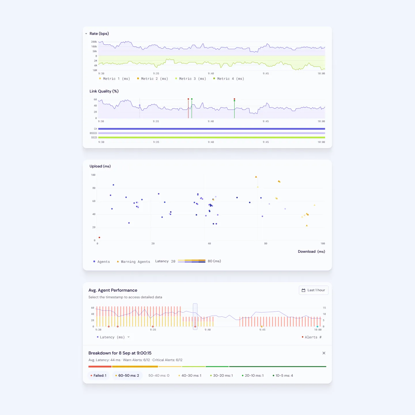
With that we redesigned all the charts to be stylistically coherent. Each chart had surrounding components so we also were building a lot of components on the fly and figuring out elements relationships possibilities in a form of prototypes. It was as I call it a confusion state, where you try things out constantly and initially find universal rules for the universe of the product.

Out of this exercice we went out having a good amount of components in all states, all the charts and table elements which is a good amount of building blocks in a product like that.
Agents
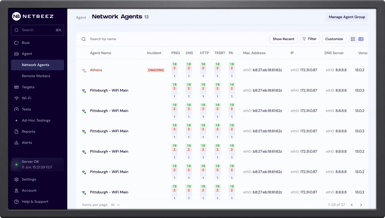
The Agent tab has a table with all the agents, or in other words, users of the internet network. Agents with issues appear at the top. By clicking on a row, a semi-modal view appears, showing general data about an agent’s ‘health’, and more specific information such as what their IP is or how their Wi-Fi signal strength is.
The main behavior while troubleshooting is to get to the logs. To make it easier, we utilized widgets to serve as filters and save some clicks for engineers. Also, we limited navigation with a second level maximum. To make it possible, all the elements behaved in inline-mode and expanded as users clicked on them.
Targets
Targets inherited a similar design. On top, there’s a table with all websites users reach during the day. NetBeez performs tests around these targets and gets their ping, latency, or understands the path signal needs to follow to reach the target.
Wi-Fi
At this point, Wi-Fi follows the same design patterns.


