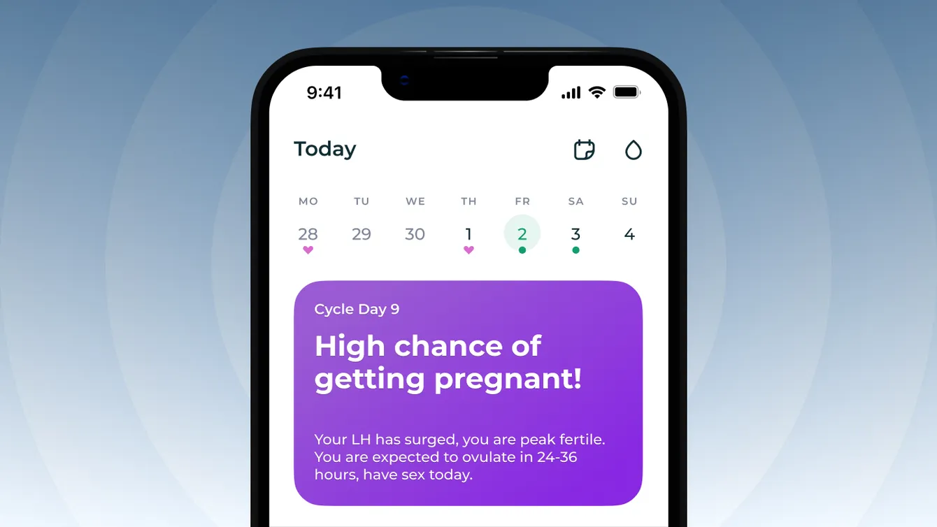
Inito helps women get pregnant by offering a hardware tester and an app to clear the fog on the road to pregnancy by highlighting fertility days and providing personalized cycle insights. I was lucky to direct the product design effort and advocate user centered desicions before the CEO.
Research Process
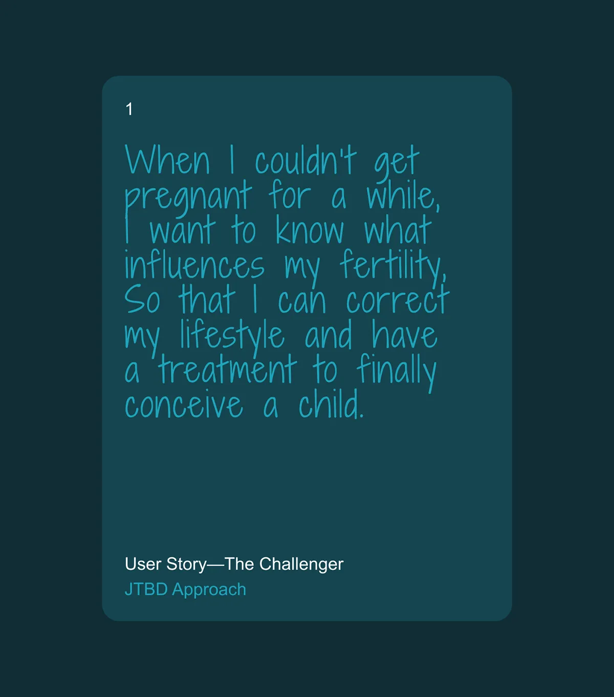

In our design journey, we turned to future mothers. We conducted numerous interviews with our audience to understand their experiences and the support they lacked. Their insights, combined with the expert knowledge of the Inito team and healthcare data, helped us highlight two essential app scenarios.
Insight 1: Today is the Most Important Day
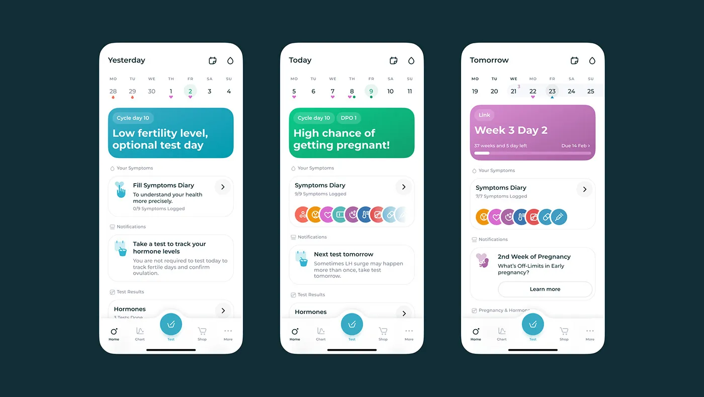
The path to pregnancy can be intricate, sometimes filled with missteps. However, each day offers a fresh start. This is why future mothers keep trying. Imagine the ideal journey of a woman with Inito:
- Track her period cycles.
- Understand symptoms.
- Identify fertile days.
- Confirm ovulation.
- Conceive a child. Baby dust!
Yet, even with all these elements at hand, something fundamental was missing from the product’s core.
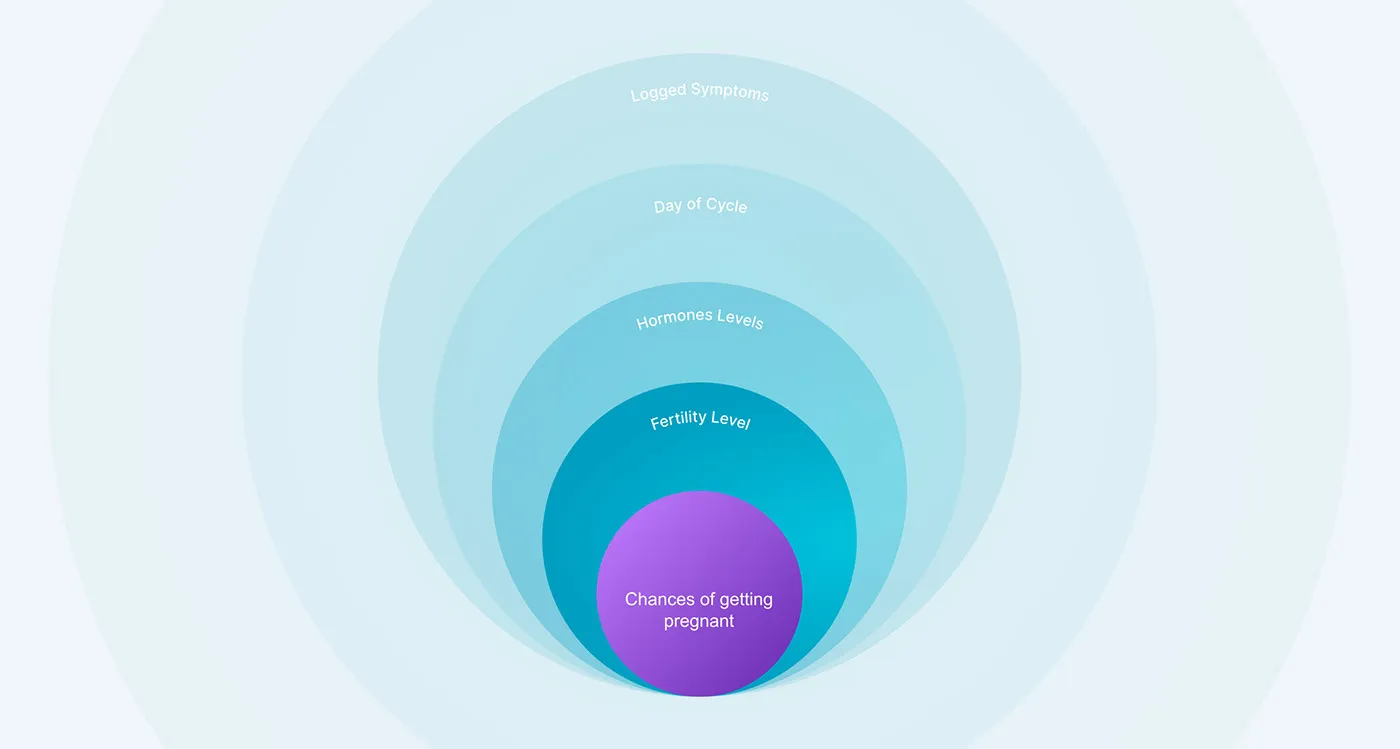
Insight 2: Conception can get frustrating, for a while
When does a woman reach for a fertility tracker? Typically, it’s after a string of disappointments. The journey to conceive can feel like an uphill battle, calling for tenacity and resilience. During these challenging times, the invaluable support and patience of a trusted friend or partner can provide a steadying hand. Will our app do the job?
Actual Brief
That’s when it clicked. Creating a useful app required more than just a sleek, user-friendly interface. Our primary challenge—and our responsibility to future mothers—was to craft a safe digital space. This space had to serve as a personal diary, a reliable friend, and an advisor to guide women through their moments of despair.
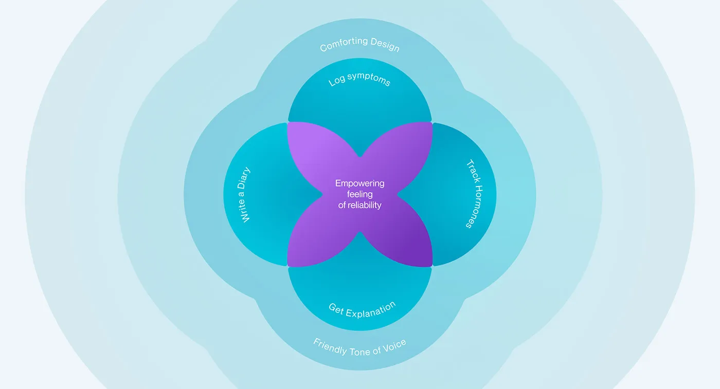
Principle 1: Comforting Design
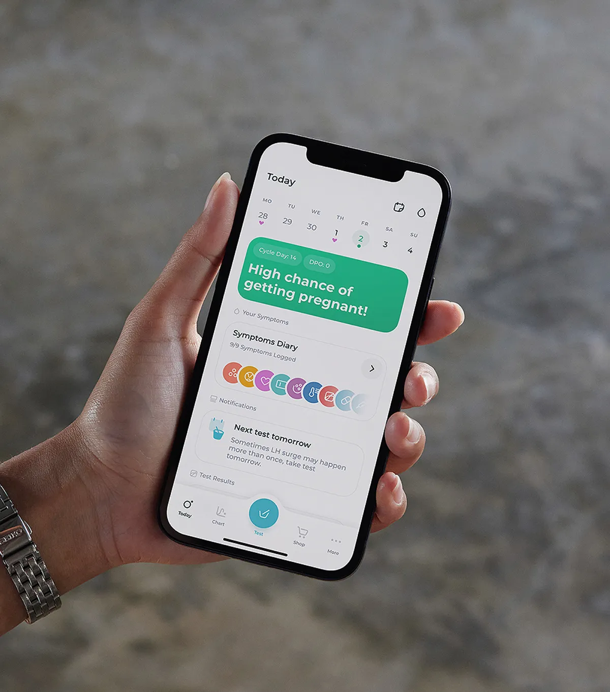
We applied rounded corners, a light theme, and bright colors to mirror the inviting appeal of a paper journal — a canvas for one’s thoughts and noteworthy highlights.
Principle 2: Tone of voice: “a soothing sound of a reliable friend”
We are compassionate and considerate. We cheer for every step you take and empathize with every setback. Though we are experts, we wear no airs. We’re here to demystify and guide, lightening your load and brightening your path to awareness.
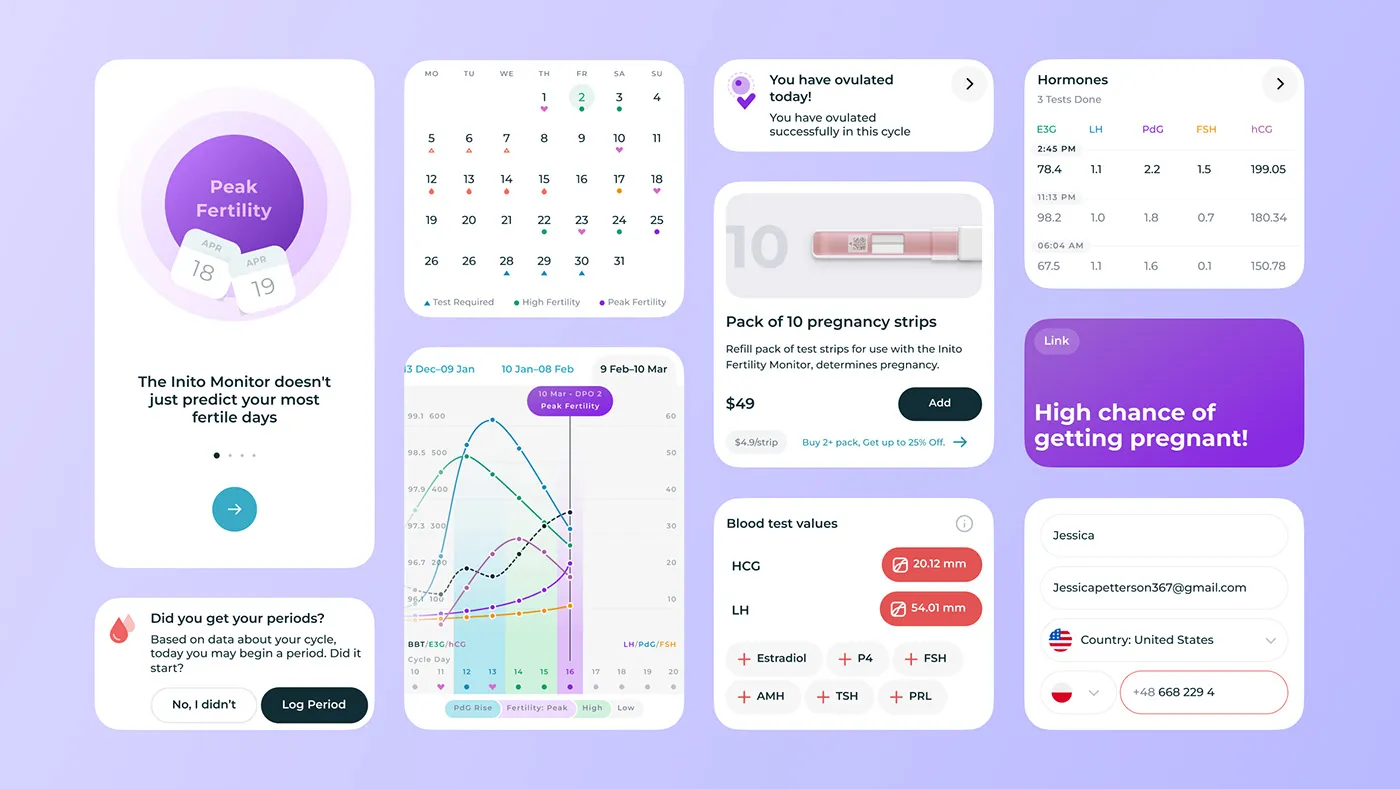
Hormones Chart
For women wanting a closer look at their hormone and symptom logs, we created an interactive chart—a personal view into their entered data.
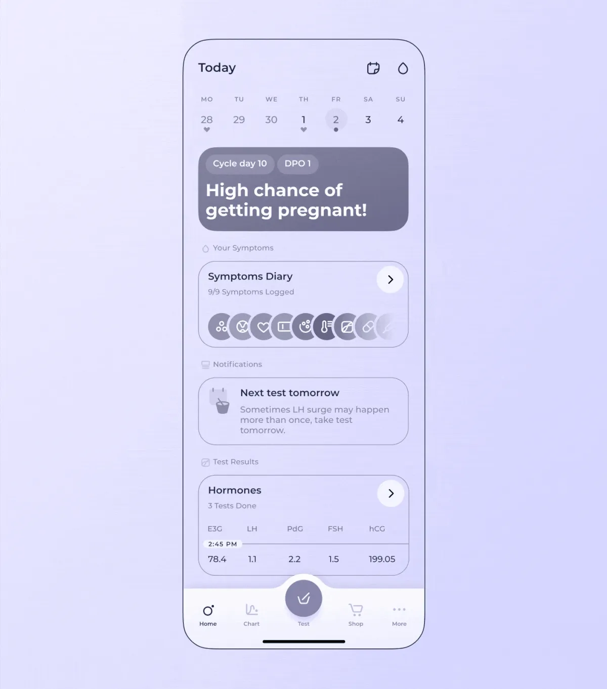
Informational Architecture
A well-structured information layout minimizes mental strain, ensuring smooth and effortless daily app usage.
Design System
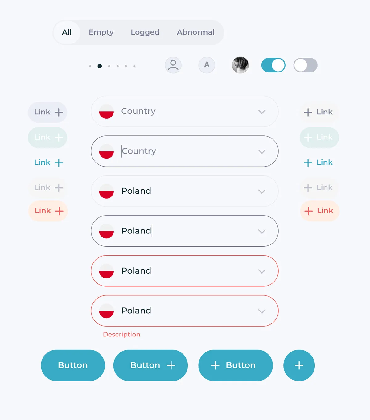
Inito has evolved from a fertility tracker to a support app, gaining consistent traction. With this evolution in mind, we have developed a design system that assists designers in scaling the product consistently. It serves as a reliable companion for them, facilitating pixel-perfect changes and the addition of new screens.

