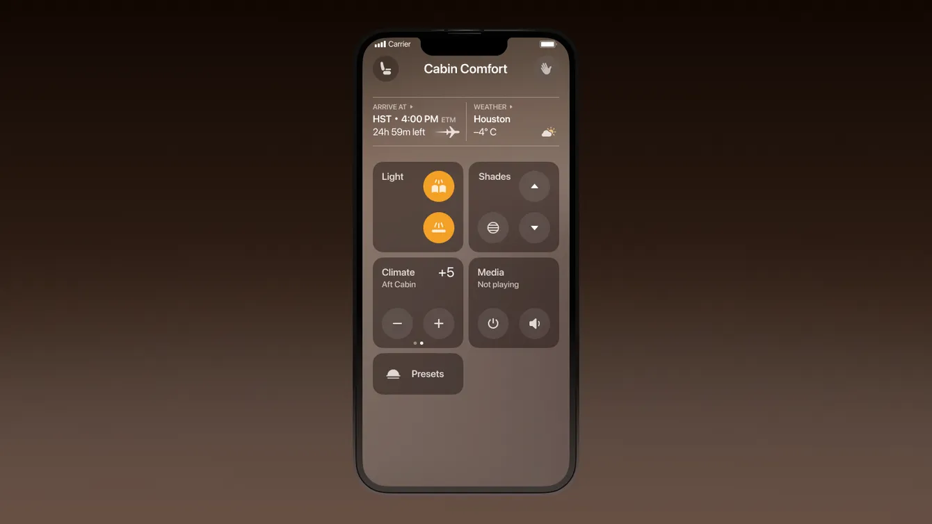
I led the redesign of a private jet app for a valued client, from conceptualization to leading the final sales call that secured the project. As the project progressed, I guided the design development, collaborated closely with the team, and ensured client satisfaction through regular communication.
Introduction
The client tasked us with enhancing the default Gulfstream app. This was the brief. To comprehend the app’s deficiencies, I typically screenshot everything and attempt to make sense of it; this case wasn’t unique.
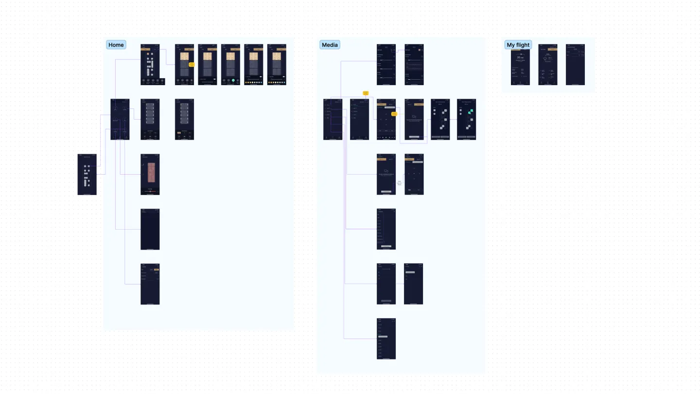
During this process, I identified three core problems within the app.
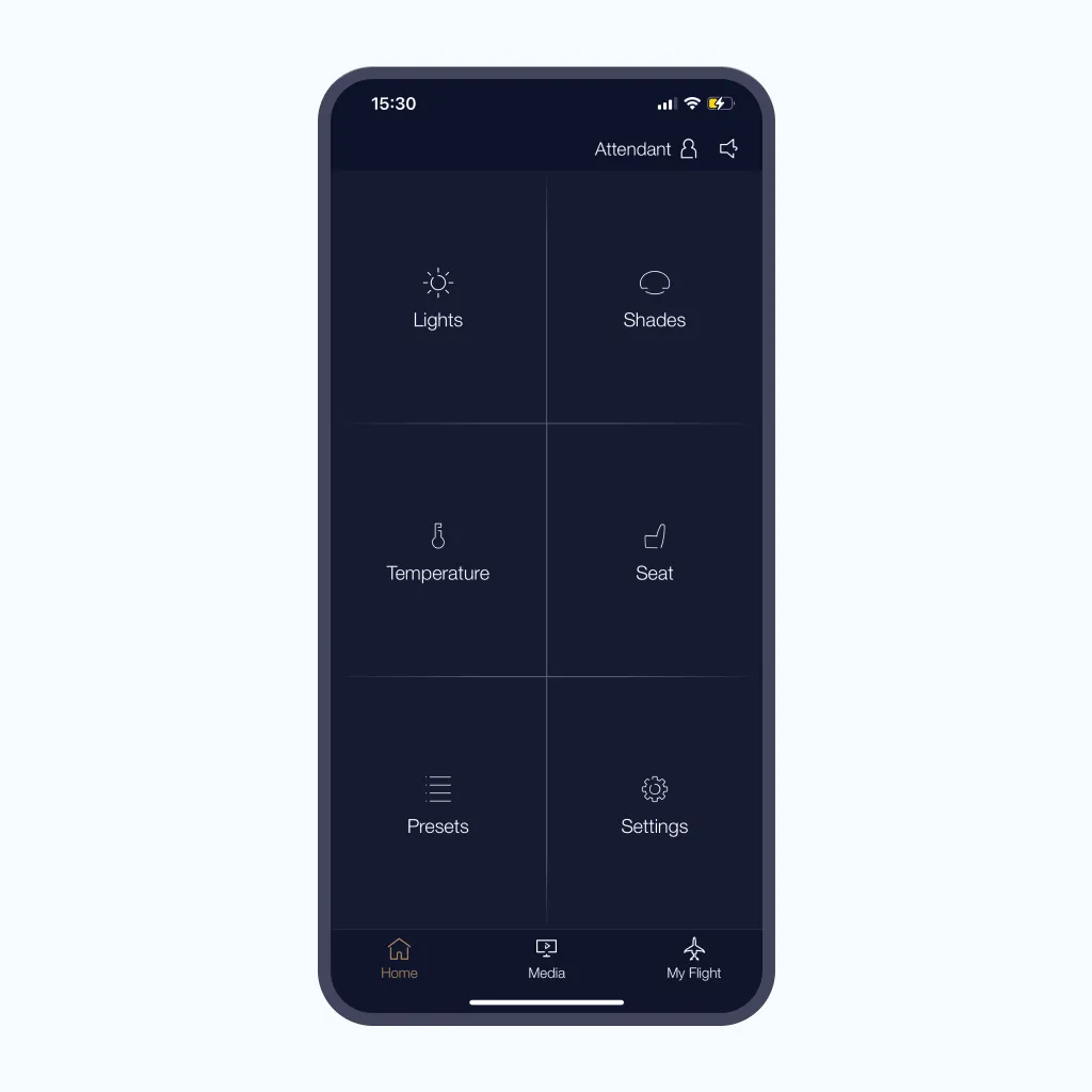
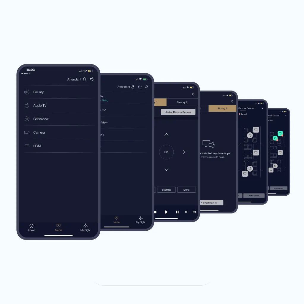
On the main screen, users could only see links to different settings without quick access or indications of what exactly is activated or deactivated. The media, a significant part of the flight experience, had its own dedicated tab with labyrinthine navigation. Once activated, users needed to revisit this tab every time they wanted to make changes, resulting in excessive taps.
To address these issues, I created a prototype. Although there were still multiple steps involved in accessing media, users could now see active states and had quick access to the player, like on streaming services.
User Interface
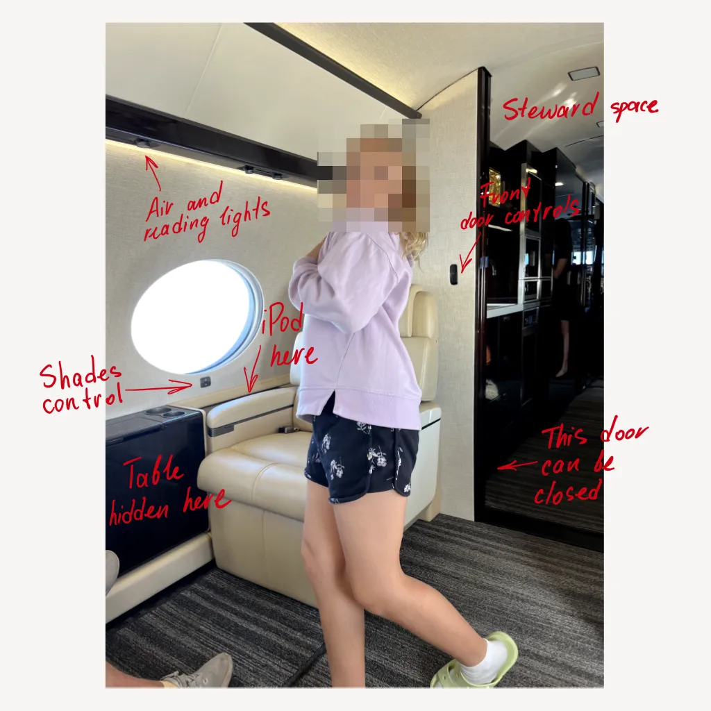
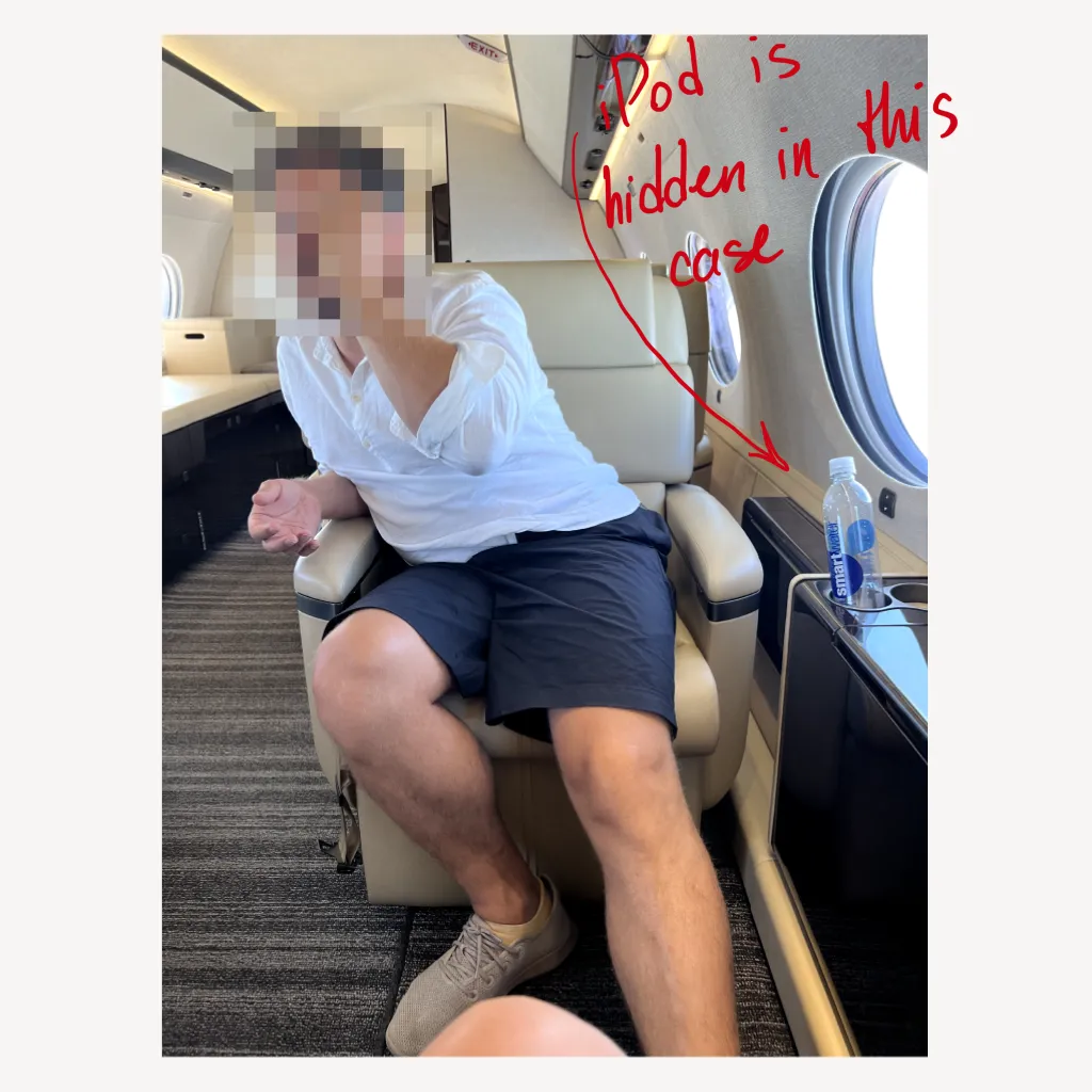
Upon approval of the concept, I collaborated with a designer under my supervision. As we progressed to the jet interior, it became apparent that matching the color scheme to the interior would be beneficial, leading us to choose a beige palette. Real-life experience suggested that users seldom needed to switch seats, as each seat had its own iPod touch for operation. Consequently, we swiftly restructured the main screen and focused on refining details such as icons and animations.
A high level of detail was crucial for our collaboration with the developers, who constituted a separate team from a separate company. We quickly identified the shortcomings of the framework they were using, which was Flatter. Consequently, we decided to rebuild every screen and animation from scratch to emulate the native iOS appearance using Flatter.
The first phase of the project was successfully delivered, and the client is now using it on flights and is highly satisfied. This success has also introduced us to the Gulfstream team, so I presume there’s more to come.
